Create A+ Emails that Motivate Donors

Designing and writing an email can seem daunting. When there are a million things to do, it may not seem worth the time and energy. However, nonprofits, like any business or consumer brand, can’t ignore the importance of email marketing. Whether you’re a small nonprofit just getting started or an established organization, you need a strong email strategy to engage with your supporter base.
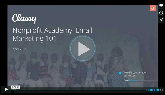
Recently, we hosted the Nonprofit Academy Webinar, Email Marketing 101. We assembled a panel of Classy experts, with members from our account strategist, marketing, and design teams, to discuss email content and design best practices. Nonprofit attendees also received live feedback on the emails they submitted for the team to review.
In the webinar, we covered a range of topics including:
• Industry-leading email marketing and design best practices
• Key metrics that help you improve email performance over time
• How to create an effective campaign-specific email marketing strategy
For a quick glimpse into what was covered, check out these four key topics that can help your nonprofit create a sound email marketing strategy. Watch the full presentation through the link below.
1. Create a Strong Email Structure
Every email needs a solid foundation, which is why establishing its basic structure is important. During the webinar, we share quick tips and suggestions on how your nonprofit can improve the six parts of a perfect email.
1. Subject Line: This should tie into the intent of the email and motivate your audience to open the message. When writing email subject lines, remember to make it clear who the email is from, keep it short, be specific, include a call to action, and use questions.
2. Preheader: Use a distinguishable header that includes your brand logo and any relevant campaign hashtags or messaging.
3. Header Images: Quickly capture a reader’s attention using visual content. This is a great place to introduce your nonprofit brand and visually contribute to the email’s overall message.
4. Main Message: This is where the email’s copy lives. Don’t use too much text, and try to break up the copy with section headlines and bullet points.
5. Call to Action: There should be an intent behind every email. Therefore, it’s important to always include a CTA. This makes the copy compelling, and it reinforces the precise step a person should take after reading the email.
6. Footer: Every email should have a footer with a link to your website or blog. It’s also the place to add any related contact information and social icons.
2. Segment Your Email Communications
It’s been proven that creating unique content for a specific audience is more effective than sending a mass appeal to every contact within your database. Hubspot reported on some of the findings from the Lyris Annual Email Optimizer Report and noted that 39 percent of marketers who segment their email lists experience higher open rates. This makes it incredibly important to know the core groups of people with whom you are communicating. In the webinar, we cover a few different ways email segmentation can be used to support campaigns and interact with supporters. These include:
• Recurring giving campaigns
• Peer-to-peer fundraising campaigns
• Fundraising events
• Organizational updates
3. Use Design Best Practices
An email’s design is important. It should look professional and include text and visual content that intrigues and informs the reader. On top of all this, there needs to be a balance between the images and text used within the email. Classy’s designers share a few pointers to keep in mind while creating emails.
• Always use appropriate font sizes. An email with text that’s too large can be offputting, and if the text is too small, some people won’t be able to read it. As a good rule of thumb, MailChimp recommends using 22px font for headlines and 16px font for body copy.
• It’s also important to use images strategically within an email. The pictures should capture the audience’s attention while maintaining a balanced image-to-text ratio.
• One last thing to remember: 66 percent of emails are read on a mobile device. This means emails need to be formatted for smaller screens and have a mobile responsive design.
4. Track Your Email’s Performance
To optimize and improve the performance of an email, it’s important to keep track of some key metrics. Rather than going into data overload, focus on a few things to start. In the webinar, we dive into what metrics you should consider tracking and how you can use this data to improve your email performance over time.
• Open Rate: Percentage of people who received an email and then opened it.
• Click-Through Rate: Percentage of people who clicked on a link within an email. This can help determine who is completing the desired intent of your email.
• Subscription Growth: This will indicate whether or not your list of supporters and donors is growing.
These metrics will help you establish a baseline of your nonprofit’s email performance. It will also allow you to make smart decisions on how to improve the content and design of your communications over time.
Watch the Full Presentation
Our webinar is packed with more expert advice on how to design and create A+ emails. Check out the entire presentation for more email tips and strategies to take your communications to the next level.

Subscribe to the Classy Blog
Get the latest fundraising tips, trends, and ideas in your inbox.
Thank you for subscribing
You signed up for emails from Classy
Request a demo
Learn how top nonprofits use Classy to power their fundraising.


