5 Ways to Optimize Your Blog CTAs for Better Conversions

Publish great content on your nonprofit’s blog consistently, and you could see your donations, fundraisers and reach increase. Inbound marketing tells us nonprofits can attract new donors and supporters by providing valuable, interesting content about a particular cause. But there’s another key component that affects whether your blog generates that next step of commitment to your organization: the call to action button.
A strategically designed and placed CTA is crucial to getting a reader or website viewer to take the next step. In this post, we will discuss five key CTA considerations to get better conversions off your blog!
1. Place Strategically
Many blogs tend to place calls to action at the bottom of each post. However, according to Josh Schwartz, a data scientist at the traffic analysis firm Chartbeat, most readers only get through 60% of an article.
Invisible Children addresses this statistic by using a “Donate” button that follows you as you scroll down the screen, which could help get better conversions. It remains visible at all times so that readers can take action no matter where they are on the page. Its strategic placement in the right margin follows the path of your eye, since viewers will read the post from left to right (and then be compelled to donate next at some point). The button’s gray color and white text also pop out from all the whitespace.

Whether you insert your call to action at the end of a blog post, on your navigation bar, fixed elsewhere on the page, or a combination of the above, the most effective placement depends on the context of the rest of the page, so make sure to test what’s right for you.
2. Use Whitespace
Whitespace, also known as blank or negative space, is the unmarked space between words or other visual items. It’s an essential component to good design, and it can help your call to action stand out from its surroundings. In our previous example, we noticed how IC’s gray donate button jumped out from the whitespace. Even if your CTA is small or simply designed, it can stand out if it’s surrounded by sufficient whitespace.
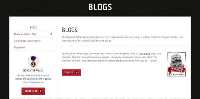
On the flip side, you can also try a lack of whitespace to convince users to take action. If another element on the page might convince visitors to take action, reduce the white space between those elements in the CTA. Take this example from the Travis Manion Foundation blog. The two red CTAs on this page are instantly striking against the white background. However, the “Start Here” CTA particularly grabs your attention because it’s placed close to an eye-catching visual (the badge) and short copy, which prompts the call to action (“Honor the Fallen”).
3. Contrast, Contrast, Contrast
To make a CTA really stand out, make sure to use colors that strongly contrast your website’s other design elements. It should still matches your site’s overall color scheme but countless A/B tests have indicated high contrast, rather than specific colors, improves conversion rates. Essentially, the site visitor should never be confused about what you want them to do next, so buttons that stand out work best.
In line with the rest of their branding, buildOn uses bright orange for the calls to action. They stand out nicely against their pages’ white or gray backgrounds.
As you test different colors for your CTA, consider the surrounding text, images, or headlines. In the following example, IC asks people to sign up for their newsletter with a bright teal “Submit” CTA at the end of each blog post:
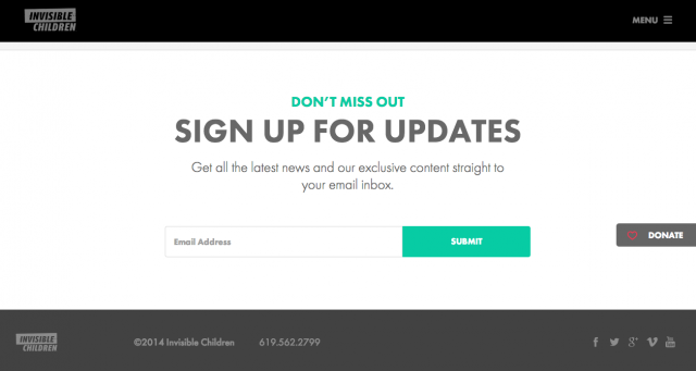
While the headline “Sign Up For Updates” is strikingly large, the smaller headline “Don’t Miss Out” stands out because it matches the teal color of the CTA button. This helps the viewer connect the dots of what they get when they sign up and click – the chance to stay in the loop!
4. Size Up
If your CTA is too small, it might go unnoticed. Make your button prominent enough to attract attention, but not so big that it overpowers the rest of the important information on the page.
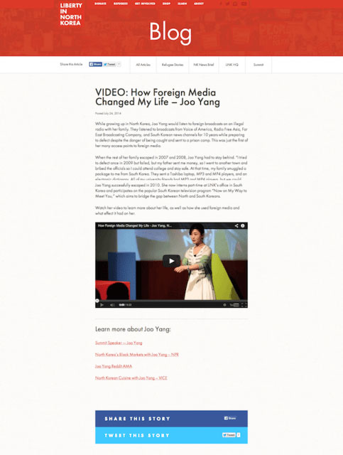
Liberty in North Korea placed their social share buttons inside larger, attention grabbing blocks. While they might be better served if these blocks were actual, clickable buttons, they’re still great hard-to-miss CTAs for spreading the word.
Testing color and contrast is probably one of the simplest A/B tests you can perform on your blog, and they can often make a huge difference. Test out several different contrasting color, matching with specific copy or other links on the page and track what seems to work best.
Shay Howe, designer and user interface engineer at Groupon, suggests using calls to action that have rounded corners – usually refered to as “pill-shaped.” He says that these tend to be more eye-catching because we more readily perceive them as clickable, noting square corners can signal an ad or banner to a viewer, who will then try to avoid it.
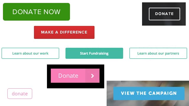
However, something else to consider is current design trends and how that shapes the expectations of site visitors. The recent trend in web diesgn has been flat, rectangular or almost rectangular buttons; which means people tend to know and understand these shapes as clickable and actionable. Check out these buttons from a variety of org sites:
Do the Smart Thing: Test
While reading through this post, you probably noticed a recurring theme: you need to test what kinds of calls to action work best on your blog. A/B testing takes the guesswork out of conversion rate optimization and helps you make data-driven decisions to improve your website. Here are a few starter tips for testing your CTAs:
1. Test one thing at a time – Whether you’re testing your CTA’s color, size, copy, or placement, isolate that variable in your A/B test. If you switch up multiple variables at once, you won’t know which change caused the increase in conversion rates.
2. Set up your control – To conduct an A/B test, you need to use an unaltered version of your CTA as your “control.” Test your new CTA design against this original version.
3. Split your sample group randomly – Test with two or more audiences. You can split your audience the next time you email out your newsletter (which directs viewers back to your blog), or you can also use content management systems like HubSpot to split incoming website traffic to your different variations.
4. Test at the same time – A/B testing requires you to run two or more variations at the same time. If you ran Test B a couple weeks after Test A, then you wouldn’t know whether any changes were caused by the variation or the timing.
You may discover that subtle changes to your buttons’ design and placement can really affect your bottom line. Now go and see which design variables impact your blog’s conversion rate!
Benchmark Yourself for Better Conversions
Image Credit: Flickr User Kirstea


