To Write Love On Her Arms Builds an Unforgettable Supporter Experience 4x Faster with Classy Studio

Mission
To present hope and find help for people struggling with depression, addiction, self-injury, and suicide
Challenge
Build a compelling annual campaign quickly and cost-effectively to elevate their story and draw people in to give
Solution
Classy Studio enabled TWLOHA to design a fully branded campaign in-house, saving them valuable time and resources while providing personalized giving experiences for every type of supporter
“We wanted to create a visually appealing, branded, mobile-friendly donation page that could tell our story and be a home for our calls to action. Classy Studio allowed us to do all that AND was cost-effective, saving us thousands of dollars we typically spend outsourcing or customizing on our website.”
– Lindsay Kolsch, Co-Executive Director
Results with Classy Studio for Year-end Appeal:
Up to $4,000
saved by moving campaign development in-house
5-6 hours
saved on developing a single campaign
$70 increase
YoY in average gift size
Bringing Complex Campaign Development In-house
At the close of every giving season, To Write Love On Her Arms (TWLOHA) launches a donor retention campaign, which includes a dedicated landing page that shares the impact of the gifts donors have made to their organization over the year.
The process typically involved hiring a contractor to design, build, and customize the page based on the experience TWLOHA wanted to provide its supporters. Because this was a very costly and time-consuming endeavor, TWLOHA instead utilized Classy Studio to create their #into24 campaign, keeping the creation entirely in-house with no extra burden on the team.
Once the marketing and development teams landed on their campaign theme, messaging, and design, they quickly got to work, using Classy Studio to bring their vision to life. The flexible drag-and-drop functionality, dynamic building blocks, and branding capabilities made their annual appeal more dynamic. The solution empowered their team to easily create beautiful direct giving pages with no outside help.

A Donor-first Giving Experience
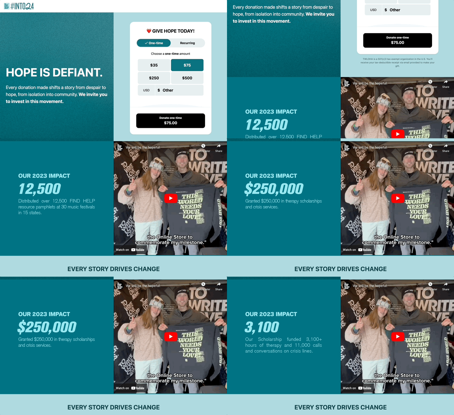
The #into24 campaign is a key storytelling moment that helps make a donor feel more connected to the mission, so TWLOHA created a thoughtful and personalized landing page that provided donors with all the information they needed to share and give, including:
- A donation form widget above the fold defaulted to a one-time gift amount
- Another donation form widget defaulted to a monthly gift amount
- A button element to create a fundraiser on Facebook
- A button element with an external URL to non-cash donations
With 83% of visitors to its donation pages coming from mobile devices, TWLOHA prioritized a mobile-first visual design and added a social share call to action so supporters can help activate their networks, creating a ripple impact in their community around mental health.
The above-the-fold experience is a critical moment for our mobile donors. We wanted the experience to quickly speak to the donor, show the impact of their support, and tell a story of the impact we can drive together while keeping our call-to-action front and center.
These improvements lead to a $70 increase in average gift size year-over-year!
Thinking Beyond Giving Season
The #into24 campaign will live on far beyond giving season. The Classy Studio functionality means that with small tweaks, the page can continue to be a resource for supporters.
We built a robust campaign page 3-4 times faster with Classy Studio, AND it’s easily adaptable for different stages in the giving season cycle.
Moving forward, TWLOHA will be using Classy Studio to further prioritize the mobile experience by building new campaigns directly from a mobile view while also adding new impact tiles to help supporters see how far a donation will go in spreading a message of hope.


