3 Crowdfunding Features to Know and Love

Convincing donors to give is hard work. Fundraising is hard work. Anything technology can do to relieve some of that stress is a win for organizations.
Classy Crowdfunding gives organizations a host of new tools to make the storytelling component of fundraising easier. While crowdfunding has always been possible on Classy through single donation pages, organizations had to design and build their own campaign microsites to tell a powerful story. That wasn’t realistic for many organizations, big and small, because it takes heavily lifting and resources to launch.
Here are three empowering Classy Crowdfunding features that let organizations launch beautiful, modern-looking crowdfunding pages and create matching email marketing campaigns, all without a single line of code.
1. The Landing Page & Advanced Designer
One of the biggest changes to campaigns this year will be the presence of a Landing Page in the campaign builder.
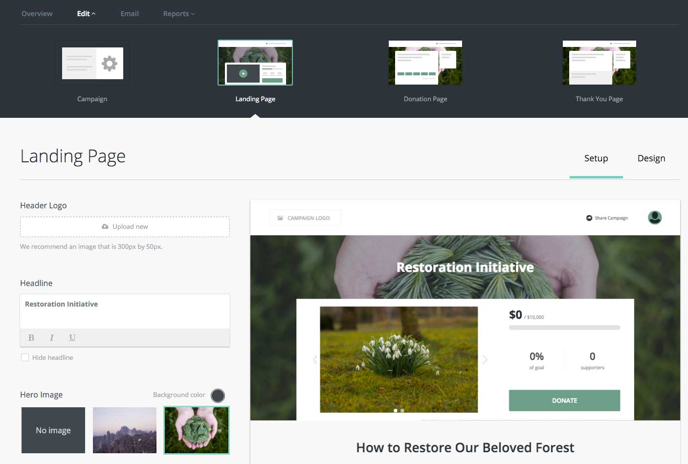
Many organizations put a lot of time and resources into building a microsite for a specific campaign. It’s a difficult project for any nonprofit. Small organizations might not have the resources at all, while large organizations might spend valuable time and energy coordinating multiple departments to pull it off. Classy’s new Advanced Designer, which will eventually appear across all campaign types on the platform, aims to lower the barrier to creating well-designed, compelling campaign pages.
To demonstrate this, let’s look at Pencils of Promise’s Season of Promise campaign from last year:
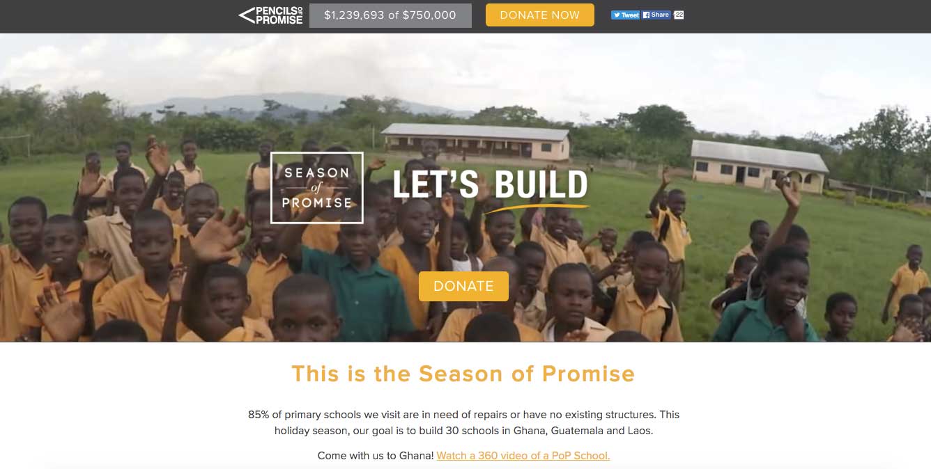
It’s a custom built microsite, complete with a captivating header, fundraising thermometer, campaign description, featured video, and donate button (among other beautiful storytelling elements).
Classy’s new Advanced Designer arms organizations with similar customizable page elements that previously required a web development team and designers to implement. More Than Me, an organization focused on girls’ education in Liberia, recently launched their #VoteforLiberia campaign using the new landing page—all with zero coding.
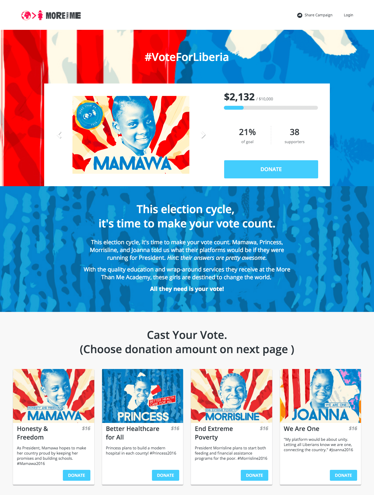
Our product development team completely restructured Classy’s foundational technology to make this possible. The new Advanced Designer offers dynamic content blocks and previews your changes in real-time.

With tools that make it easier to adhere to design best practices, organizations can launch beautiful campaigns faster and with fewer resources. While the Advanced Designer is not meant to replace a good eye for design, it does save organizations the hassle of time-consuming, menial design tasks. For example, you can change image opacity with the new suite of tools or find a high-quality image from the built-in stock photo library.
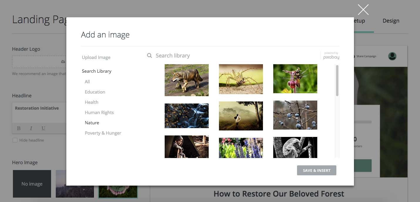
One of the obvious benefits of these upgrades is that organizations can get a campaign page up much faster than they could before. But the deeper value lies in making campaign storytelling accessible to all users.
It’s a challenge for any organization to track what makes a campaign landing page compelling. That’s why the new builder was created with design, fundraising, and donor engagement best practices in mind. Whether you’re a startup or enterprise-level organization, you now know your campaign landing page adheres to donors’ expectations of style, storytelling, and engagement. It may seem small, but the ability to easily fine-tune the design of your campaign can make a big impact on how prospective supporters perceive your organization’s brand and cause.
2. Impact Levels
Impact levels motivate donors to give by defining the impact their dollars will create. They’re important for educating would-be supporters on your programs and work, as well as telling a cohesive campaign story.
Previously, organizations needed to create a custom impact graphic and contact our support team to add it to a campaign or donation page. This takes time and effort on the organization’s end and if they want to make an update, it had to go through customer support.
The new impact levels are simple: upload a photo, set a donation amount, and add a description. When a supporter selects an impact level, the set donation amount will pull through to the donation page. No additional support or coding necessary.

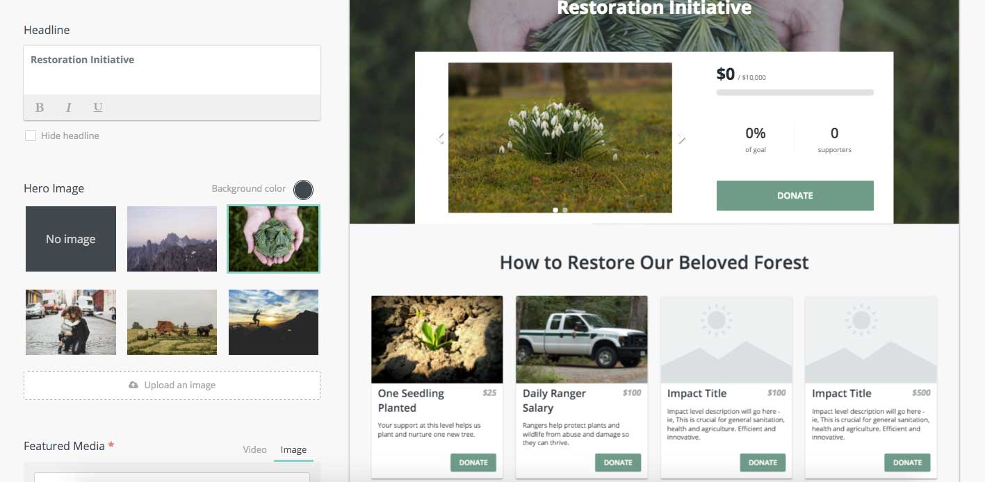
Anyone can easily create impact levels that help your donor visualize their place in a campaign’s success story.
3. Email, Email, Email
Probably the most exciting (and most requested) functionality is the emailing suite. This toolset will evolve and grow, but for now the new crowdfunding campaign includes a versatile set of email templates. Customize, send, and track all sorts of emails directly from your campaign manager. The email design and functionality were also built with email marketing best practices top of mind, so you’re always putting your best foot forward when creating and sending campaign appeals.
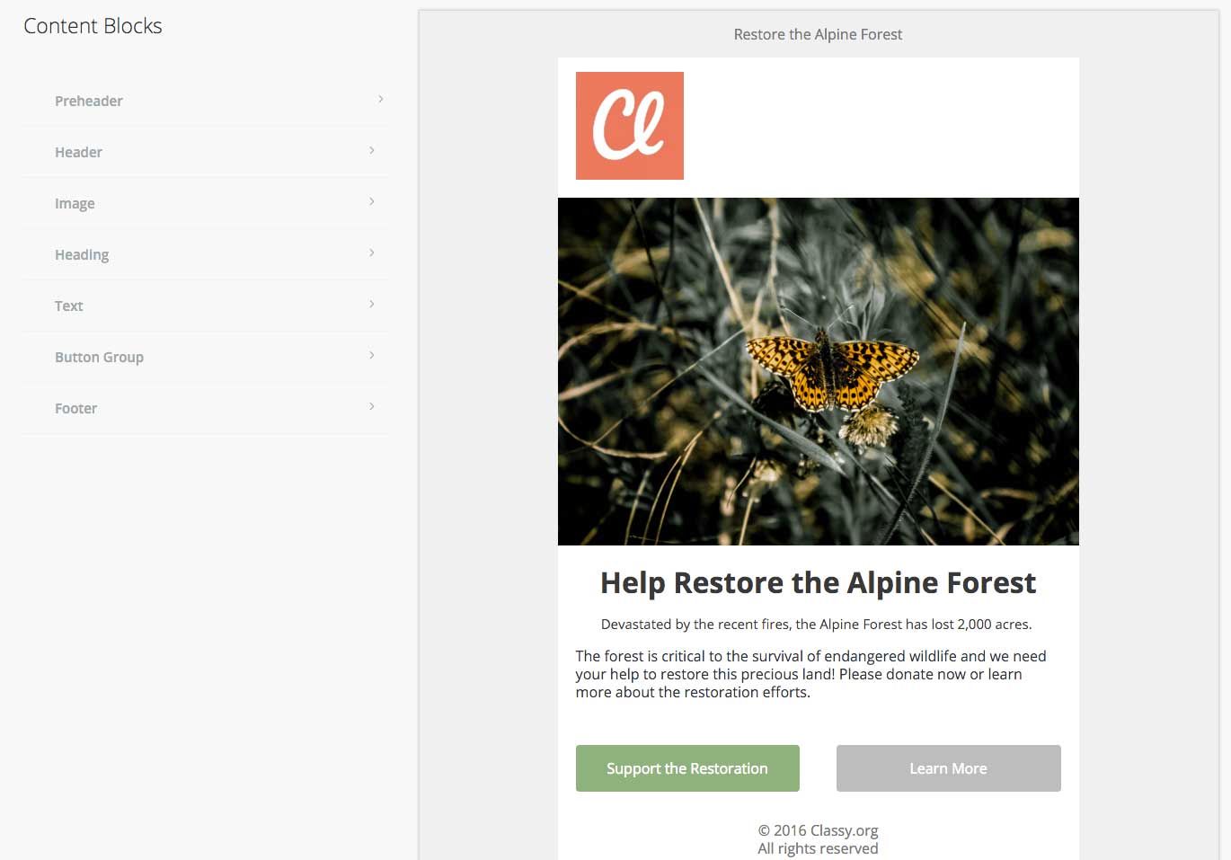
Some of the newest emails and functionalities include:
1. A donation receipt that includes a printable PDF, a top-requested feature

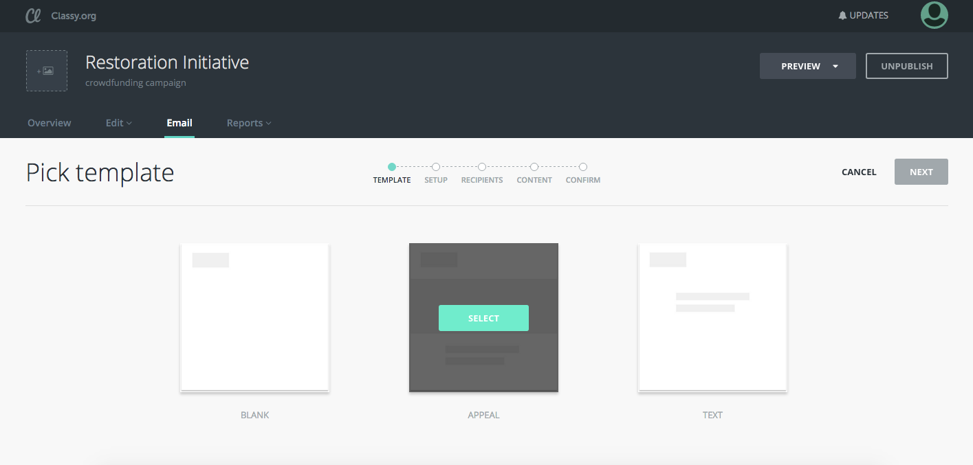
2. Three new email templates, ready for customization out-of-the box
3. Metrics tracking to benchmark yourself and improve engagement
We want to provide organizations with simple and straightforward technology, so you spend more time focusing on your mission. The official release is coming soon, so get ready to write a compelling story with more ease and flexibility than ever before.
Subscribe to the Classy Blog
Get the latest fundraising tips, trends, and ideas in your inbox.
Thank you for subscribing
You signed up for emails from Classy
Request a demo
Learn how top nonprofits use Classy to power their fundraising.


