4 Awesome Visual Features from Top Nonprofit Websites

Visual content grabs your audience and engages them in a way that your mission statement can’t. It’s important, of course, to include the details of your organization’s work on your website, but that may not be enough to inspire most people.
Visuals are processed faster by the brain and the information is more likely to be remembered than information in text. Visuals also elicit more shares on social media, increasing the information’s reach. If you want your audience to understand and remember your cause, you must offer visual evidence. Compelling visual content is a key component of top nonprofit websites.
Here are four outstanding visual features from nonprofits that illustrate a problem and inspire the viewer to take action. Although pictures and videos are also great ways to show your work, interactive features like these can make your cause especially memorable and engaging.
1. Mazon Shows Hunger in America
Mazon is a nonprofit organization working to eradicate hunger in the United States and Israel. They fund local programs, mobilize faith communities, and advocate for hunger support in the government and public spheres. Founded in 1985, Mazon aims to humanize and dispel myths about hunger and encourage communities to support those in need.
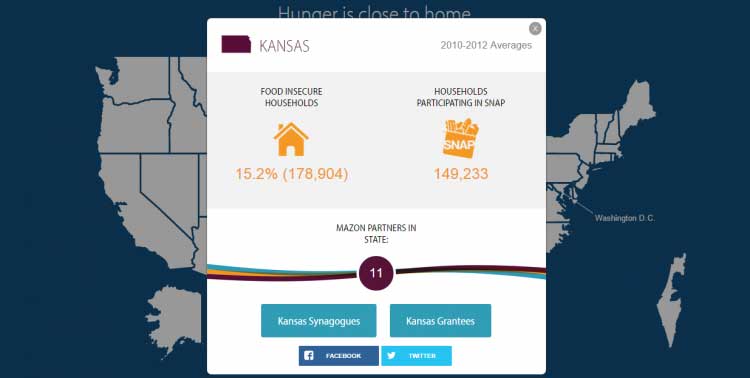
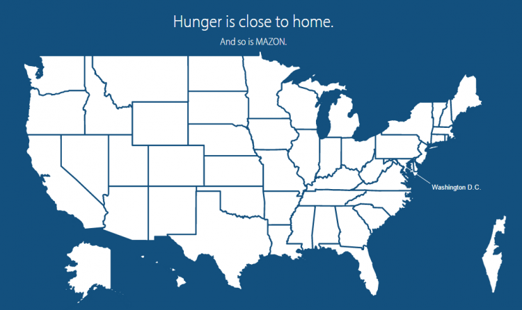
When we talk about hunger, we often think of it as being a distant problem that doesn’t affect many people in developed countries, but Mazon wants to show just how close hunger is to each and every American. To show the reality of hunger, the site includes a dynamic map of all 50 states, showing local levels of food insecurity.

Users need only click on their state to find out the percentage of households facing food insecurity, the number of homes participating in the SNAP program (formerly known as food stamps), and the number of Mazon partner organizations in the state. From there, supporters can find hunger organizations and participating synagogues nearby. Mazon’s hunger map makes the problem real for the public and shows how they can get help or get involved.
2. KaBOOM! Shows You Where to Play

KaBOOM! is a national nonprofit that is working to give every child the chance to play. Kids today are playing less than the generation before and it is contributing to the onset of behavioral, psychological, and medical problems. Focusing on at-risk children in low-income communities, KaBOOM! offers grants to build playgrounds and partners with local organizations to foster a more playable society.
KaBOOM!’s Map of Play doesn’t just show progress, it helps create it. The Map of Play is an interactive map of a community’s playspaces, such as parks, playgrounds, and sports fields. KaBOOM! is striving for a future when every child in America lives within walking distance of one of these spaces.
The maps feature playgrounds that the organization has supported and worked on, but users can easily add an existing playspace or add a rating or picture to an entry. The search function allows users to find nearby playspaces by simply plugging in their city or zip code. The Map of Play is like Yelp! for playgrounds, used to spread awareness and create a culture of play.
3. Blood: Water Shows You the Price of Change

Blood: Water is tackling two deadly crises in Africa, HIV/AIDS and lack of clean water. Working in Ethiopia, Kenya, Rwanda, Uganda, and Zambia, they partner with local advocates and grassroots organizations to bring HIV/AIDS prevention and support services along with clean water and sanitation to over 1 million people.
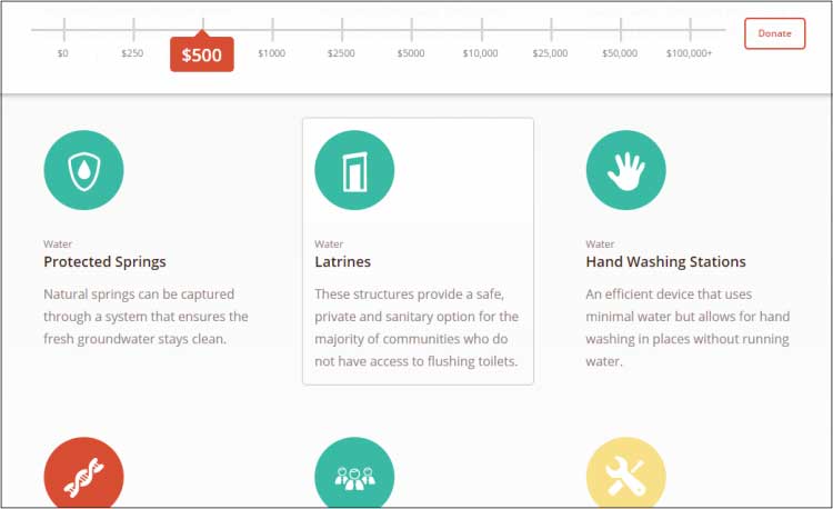
Blood: Water’s solutions are long-term and multi-pronged, including health clinics, community wells, hygiene training, support groups, and more. To help donors understand their work and feel empowered to make a difference, their website has an interactive tool to show what certain donation sizes can accomplish.
At the top of the page, they have a dashed line representing different donation sizes. As you scroll down the page, the donation bar goes with you. On this page, Blood: Water lists out 18 different solutions they use with a colorful icon and short description. When you hover over the icon, the cost of the solution shows up in the donation bar above.
Notice that the donation bar goes all the way up to $100,000, which makes moderately priced solutions like latrines appear especially inexpensive and gives big donors the option to act quickly.
4. Splash Proves It

Splash sums up their mission simply and succinctly: “We clean water for kids.” This international nonprofit is responding to the migration of impoverished people to urban centers by working with local government and businesses to scale the technology and processes that make clean water available to tourists staying in upscale establishments. Splash is scaling water, hygiene, and sanitation to create a sustainable system that includes and protects everyone.
Splash has built a website specifically to track their work and offer transparency to their donors. The site, which allows you to find projects by map or list, is called Proving.it. To make the experience even more personal, donors and supporters can log into proving.it and track specific types of projects (like displacement camps or hospitals) or track projects in particular locations.

Proving.it allows users to track how a project is going, sponsor an initiative, and see just how many people are benefiting from it. To spread the word, supporters can also share project profiles through email and social media.
No matter what cause sector you work in, visual representations of the problems you face and the solutions you offer can go a long way toward inspiring and mobilizing support. Consider how your website could incorporate more visuals and even interactive features to engage your audience and bring your work to life.
If you have more examples of awesome visuals from nonprofit websites, let us know in the comments.
Plan a Charity Run/Walk Like a Pro
Subscribe to the Classy Blog
Get the latest fundraising tips, trends, and ideas in your inbox.
Thank you for subscribing
You signed up for emails from Classy
Request a demo
Learn how top nonprofits use Classy to power their fundraising.


