4 Ways to Engage Donors from Your Nonprofit Home Page

Your nonprofit home page is often a potential supporter’s first touch point with your organization. If its design and messaging don’t connect them to your mission right away, visitors might leave uninspired to take action.
But optimizing your home page requires more than simply stating your organization’s mission statement. You need to show people that they have a role to play in your work. Not only should they be able to easily see that you want their help, but they should know exactly what to do next.
Here are four ways to improve your home page design to encourage site visitors to take action for your cause.
Your website’s main goal is to collect donations, so make sure you have an eye-catching donate button. Make it easy for potential donors to find by placing it in the top menu of your home page and making it a highly contrasting color that stands out from the rest of your page. Placing a blue button on a blue background, for instance, will probably make it difficult to spot.
Keep in mind that when supporters decide to take action, they are more likely to follow through if the process is quick and easy. This means that after hitting your donate button, visitors shouldn’t have to click through three screens before finally landing on your donation form. This increases their chances of abandoning the process altogether. Guide visitors directly to your form in one step by having your donate button link directly to your donation page.
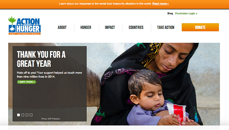
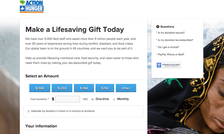
In this example, Action Against Hunger’s bright orange donate button is hard to miss at the top of their home page. When donors click on the call to action, they are directed straight to the organization’s donation form to complete their gift.
2. Tell Donors Exactly How to Get Involved
Beyond making a donation, you need to show supporters the other ways they can take action for your cause. Clearly presenting these calls to action is crucial to getting people to respond. Whether you want supporters to start a personal fundraising page or sign up to volunteer, your nonprofit home page should clearly display how people can support your mission.
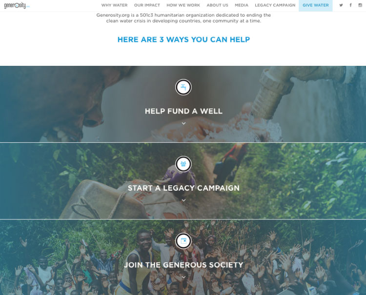
Take Generosity.org’s website, for instance. Scrolling down their home page reveals a section that lists the three ways supporters can take action for the cause: donate, fundraise, or join their monthly giving program. A simple, clear presentation like this lets people know exactly what they can do next.
3. Collect Supporters’ Emails to Keep Them In the Loop
Sometimes, even if you’ve optimized your home page’s calls to actions, your supporters might not be ready to take action just yet. In this case, it’s important to encourage them to subscribe to your newsletter or blog. This is another way for people to join your community and stay updated on what your organization is up to. Not only does a newsletter keep the conversation going between you and supporters, it can bring them back to your website at a future time where they can take further action to support your organization.
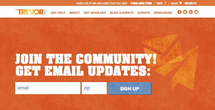
Make sure you have a section on your nonprofit home page where people can enter their email address and subscribe to your newsletter or email updates. Here, you can see The Trevor Project presents a clear area where site visitors can sign up for regular updates from the organization.
4. Spotlight Your Current Campaign
Your website is a platform you can control without extra cost, so use it as a key marketing asset to broadcast any special initiatives. When you launch a campaign, feature it front and center on your home page.
Display a bold call to action that directs people to your campaign webpage or micro-site, and avoid crowding other links or buttons around it. If you have a rotating banner on your home page, it’s a good idea to feature your campaign as the first slide image. The main point is to showcase your campaign front and center on your website.
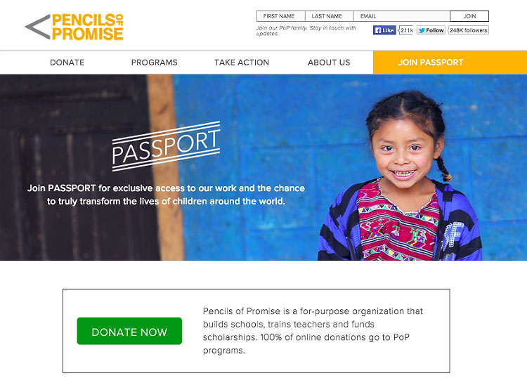
For example, Pencils of Promise prominently features their monthly giving program, Passport, at the top of their home page. This image, which leads to the appropriate campaign webpage, grabs site visitors’ attention as soon as they land on the organization’s home page.
Don’t just talk about your mission on your website; make sure your donors know they have an important part to play in it. Your nonprofit home page should also give clear calls to action so site visitors know how to help. It’s your job to guide potential supporters to the next steps they can take to support your organization.
Keep Donors Coming Back: Download the Customer Service Guide Now
Photo Credit: flickr user Marc Falardeau


