4 New Ways to Enhance Your Fundraising Performance with Classy Studio

High-performing fundraising strategies offer meaningful experiences for supporters that form deep connections and drive conversions. At Classy, we’ve seen the results nonprofits can achieve when they have the tools to turn their vision into a reality.
After its launch earlier this year, organizations across various industries and sizes began using Classy Studio, bringing to light even more unique use cases to enhance fundraising performance than we imagined. While we expect to continue incorporating these ideas into the product and innovating as a community, we knew we needed to share a few with you all.
If you’re unsure what Classy Studio is or considering switching your current fundraising platform, we’ve got you covered. Get ready to dive deep into four Classy Studio use cases that drive fundraising performance. You’ll learn exactly how to access key features, see real campaign examples, and make the most of our fundraising platform all year.
What Is Classy Studio?
Classy Studio is a fundraising platform that powers and enables campaigns designed for performance and ease. With Classy Studio’s campaign builder, nonprofits can create campaigns that streamline donors’ checkout experiences and optimize them for conversion to completed donations, registrations, and purchases.
Nonprofits are diving right in and seeing results with Classy Studio campaigns:
- Prevent Child Abuse America raised 2.2 times more year over year and 150% of their goal on Giving Tuesday.
- To Write Love on Her Arms saved $4,000 by moving campaign development in house with Classy Studio for their year-end appeal, which saw an average gift size increase of $70 year over year.
View More Nonprofit Success Stories
One key aspect that excites us about Classy Studio is the thoughtful design that considers everything a nonprofit needs to reach ideal donors. It’s a culmination of years of feedback and a decade of experience listening closely to what matters to supporters and fundraisers alike.
Key Terminology
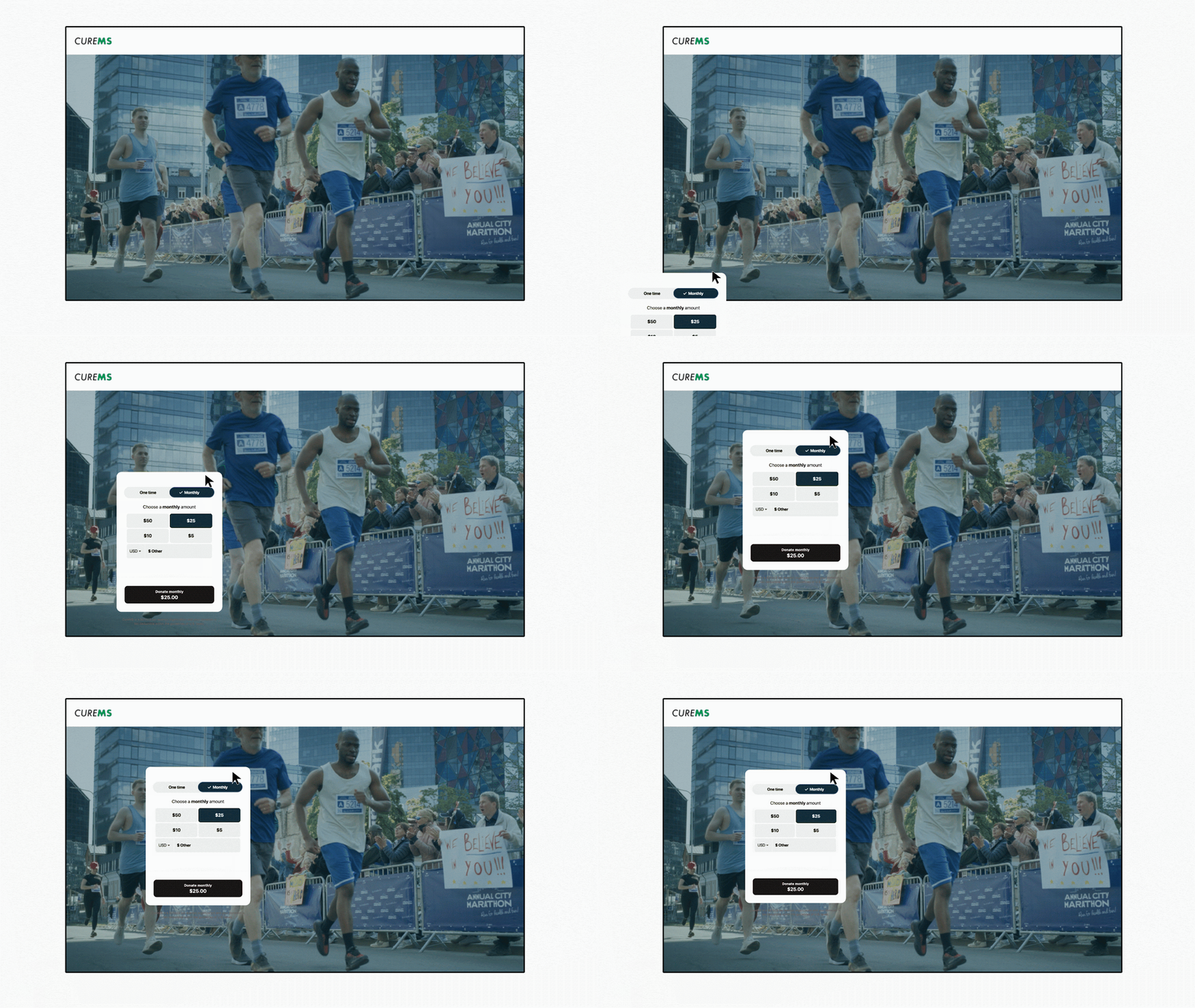
Understanding how to use Classy Studio is the best way to maximize its features. Everything is built in layers, meaning that everything you create builds on the last.
Here’s a breakdown:
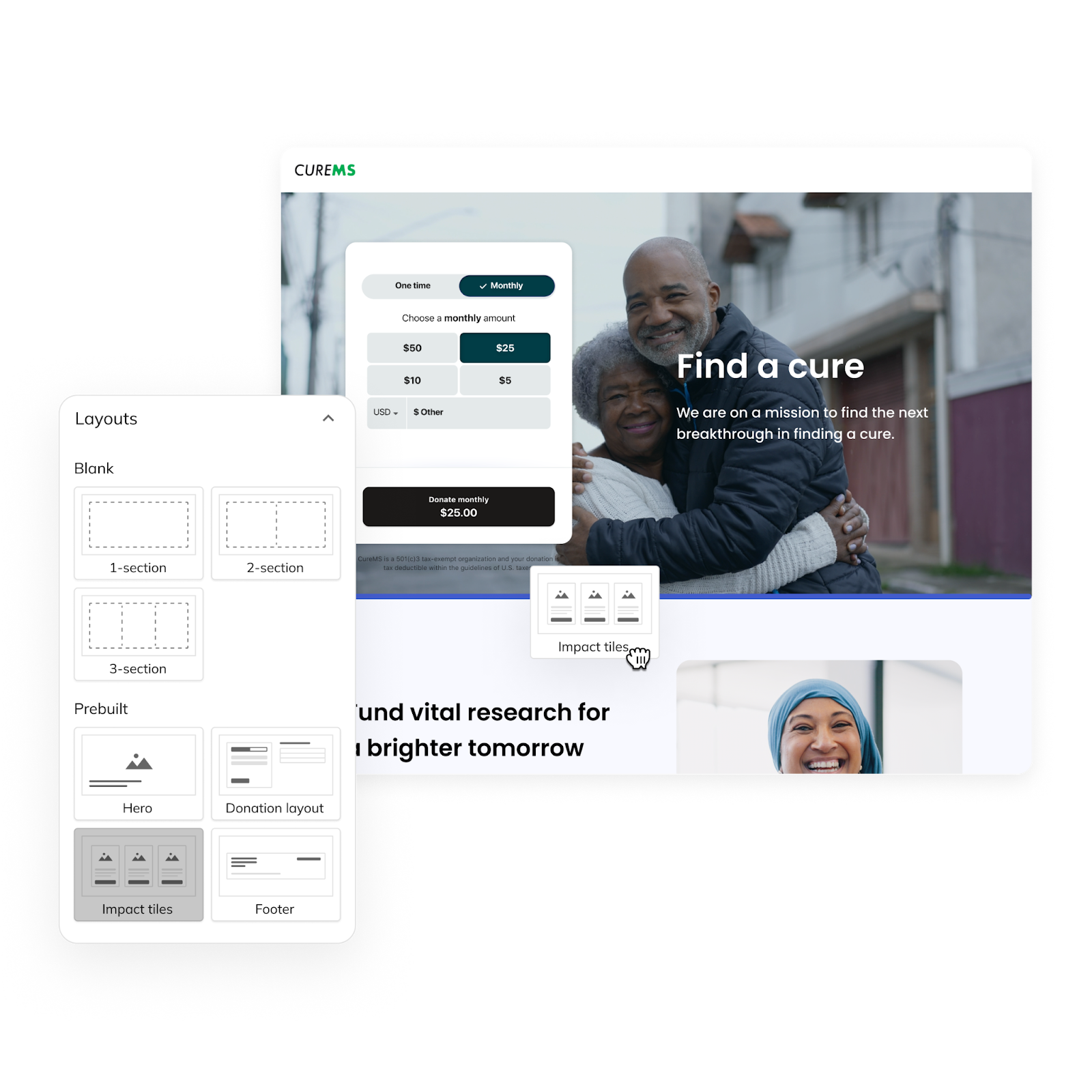
- Layout: Establish the base layer that you’ll dress up with different sections, elements, and widgets.
- Sections: Define different columns to display information in one-section, two-section, and three-section layouts.
- Elements or widgets: Play with where the content of your page lives for easy navigation and scrolling.

Classy Studio comes with a lot of freedom to design your campaign and make it look the way you want. With that freedom, we encourage some powerful use cases to increase your search engine optimization (SEO), conversion rates, and overall experience.
4 Creative Classy Studio Use Cases
1. Welcome Recurring Donors with a Standout Campaign
Building a strong recurring donor acquisition strategy is critical to all nonprofits. The first step is creating a dedicated recurring giving campaign to inspire and nurture a sustainable revenue stream to combat fundraising seasonality.
Classy platform data shows that among nonprofits making over $50,000, 37% of revenue comes from recurring donations, and we expect to see this trend upward across the social sector. We also see that the value of a recurring donor is 9 times a one-time donor.
7 Monthly Giving Program Examples to Inspire You
A great time to plan your recurring giving campaign is during slower months when giving activity may dip. Think about the start of a new year or summer months for creativity and preparation. This way, you’re ready to go for your big giving days or event seasons with a way to capture more loyalty from recurring gifts.
Classy Studio features to customize your giving experience for recurring donors include:
- Adjust your default donation widget settings to recurring and decide if you want to disable one-time donations entirely.
- Offer monthly donations and membership campaigns with an annual gift option.
- Show different levels of giving with impact titles and customize them fully to specific program designations (you can also have all recurring donations go to unrestricted funds).
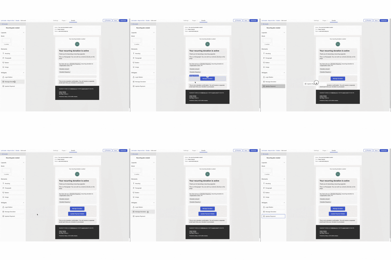
Classy Studio’s enhanced email studio extends a personalized experience for recurring donors after they complete a gift:
- Send customized emails with the same drag-and-drop functionality used to build campaigns to bring in specific elements, images, and more.
- Add a login button, manage donation button, and an update payment button for supporters to quickly navigate to their next step (this is where we see many supporters seeking guidance).
- Add layouts with various sections and images that link back to education about your cause for recurring donors to stay invested.
How to Write the Perfect Fundraising Email [TEMPLATES]
A Recurring Experience to Inspire: Concern Worldwide
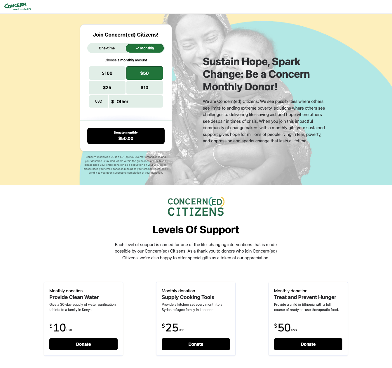
Concern Worldwide built a recurring campaign that offers supporters recurring and one-time donation options. By offering both options, they can achieve their main campaign goal of inspiring and collecting recurring donations while capturing one-time supporters.
The campaign’s impact tiles help donors see the impact of an automated gift and guide them through the different ways each monthly giving amount supports their mission. Lastly, the default option on the page supports conversions, offering a $50 monthly donation in this case.
While $50 is the right amount for Concern Worldwide’s campaign, you should customize it to suit your donors’ giving levels and behaviors.
With Intelligent Ask Amounts in Classy Studio, you can provide real-time, predictive, and personalized ask amounts for every donor. By avoiding a default amount that’s too high or low for your audience, you can increase a supporter’s willingness to donate.
2. Offer Impressive Corporate Sponsorships
Companies are embracing charitable giving and corporate partnerships as employees seek purpose-driven work, making corporate social responsibility a higher priority.
Corporate partners can support large-scale events and campaigns, sponsor donation matches, and offer workplace giving campaigns that expand your reach. A professional and straightforward campaign is a great way to impress a potential partner. We’ll show you how to create a campaign that feels unique to the business you work with and converts more donations.
Classy Studio features to customize your corporate sponsorship experience include:
- Show your organization’s branding and the corporation you work with, or choose to design a campaign that feels like an extension of your corporate partner’s website.
- Take advantage of multisection layouts to include various branding elements or sponsor shoutouts optimized for mobile.
- Add a video widget to explain why a corporation is fundraising for you and enhance the supporter experience.
- Highlight progress bars to display corporate sponsorships’ impact on your fundraising totals.
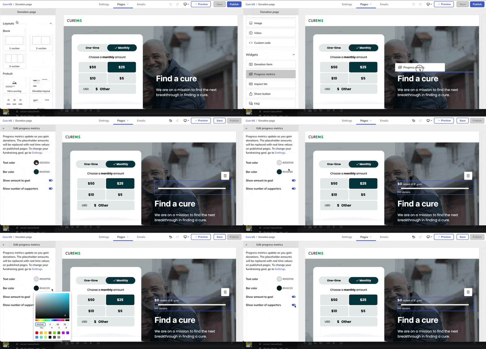
A Customized Experience to Inspire: Oklahoma Medical Research Foundation
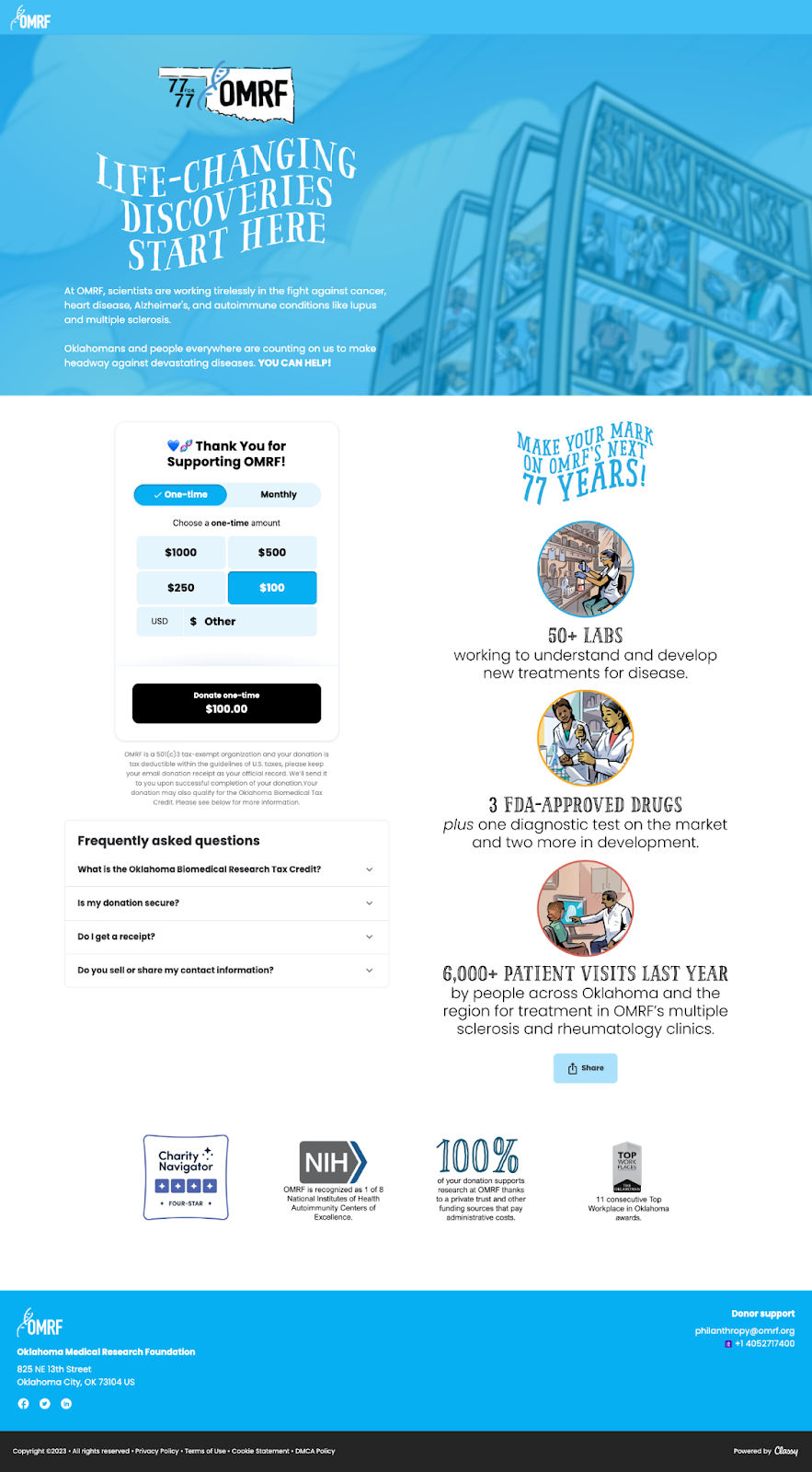
Oklahoma Medical Research Foundation strategized a campaign page that brings the organization’s branding to life. From the fun visuals to the standout fonts, visitors can feel the heart and personality of the nonprofit they support.
The layout OMRF chose feels simplistic and easy to replicate for any future campaigns they run or collaborate on with corporate partners and community organizations.
3. Personalize the Giving Experience with Segmented Appeals
Personalization is critical in the modern fundraising climate, surrounding donors with options about where to give. AI tools for nonprofits and other technology advances make it easier for brands to deliver customized experiences. It makes sense that donors want to experience that feeling when donating.
Building relationships requires meaningful details that show people you deliver a giving option tailored to them. It’s a subtle way of proving to donors that you honor how they want to interact with your organization.
Segmented appeals are like personalized donation pages or forms to a specific set of supporters. Classy Studio makes it easy to create these without much time or effort.
Classy Studio features to customize your segmented appeals include the ability to:
- Create donor segments, like recurring donors, first-time donors, and volunteers.
- Create emails and campaigns that reflect content, layouts, and visuals that appeal to donor segments.
- Take advantage of segmented appeals by duplicating campaigns and changing aspects based on the audience.
- Consider changes to your donation widget, such as adding Intelligent Ask Amounts and giving frequencies.
- Send the new campaign versions out directly to donor segments to increase their chances of donating.
- Customize your email copy in the email studio to appeal to your segment and match your duplicated campaign.
A Segmented Appeal Experience to Inspire: Feeding San Diego

Feeding San Diego created a unique campaign for loyal and local donors to respond to the devastation of flooding in the area. The campaign page speaks to the timely need and showcases larger giving amounts likely to activate this audience.
The campaign page also features powerful imagery that connects to donor emotions and statistics that build a sense of urgency. Supporters can take action and learn more about the cause from one streamlined experience.
4. Create Simpler and More Engaging Mobile-First Campaigns
Advertising primarily on social media, setting goals to reach younger donors, and engaging event attendees on the go have become common practices. If that sounds like your nonprofit, a mobile-first approach might be the best approach for your campaign.
Mobile optimization must be a priority. Recent reports show that 60.67% of website traffic comes from mobile devices, and 92.3% of internet users consider accessing the internet through their smartphones more than other devices.
Most campaigns work on mobile devices, but truly customizing the experience for a mobile audience will help you stand out. Classy Studio has taken mobile optimization to a new level, keeping donors on your campaign long enough to take action.
Classy Studio features to customize your mobile campaign experience include:
- Editing your campaign from a mobile view to see how it’ll appear to supporters on any channel they access.
- Prioritizing content on the left side of our campaign, like your donation widget, value proposition, or story, which will appear first in a mobile-stacked view.
- Adding images using the image element to ensure high-quality assets every time on every device.
- Placing elements directly onto your mobile-optimized layouts easily using drag and drop.
- Adding a one-section layout for background images on mobile and drag it to the top of your content.
- Offering donors a smooth experience mobile-optimized automatically with one-click checkout, prefilled digital wallets, and autocomplete address fields.
A Mobile-First Campaign to Inspire: Prevent Child Abuse America
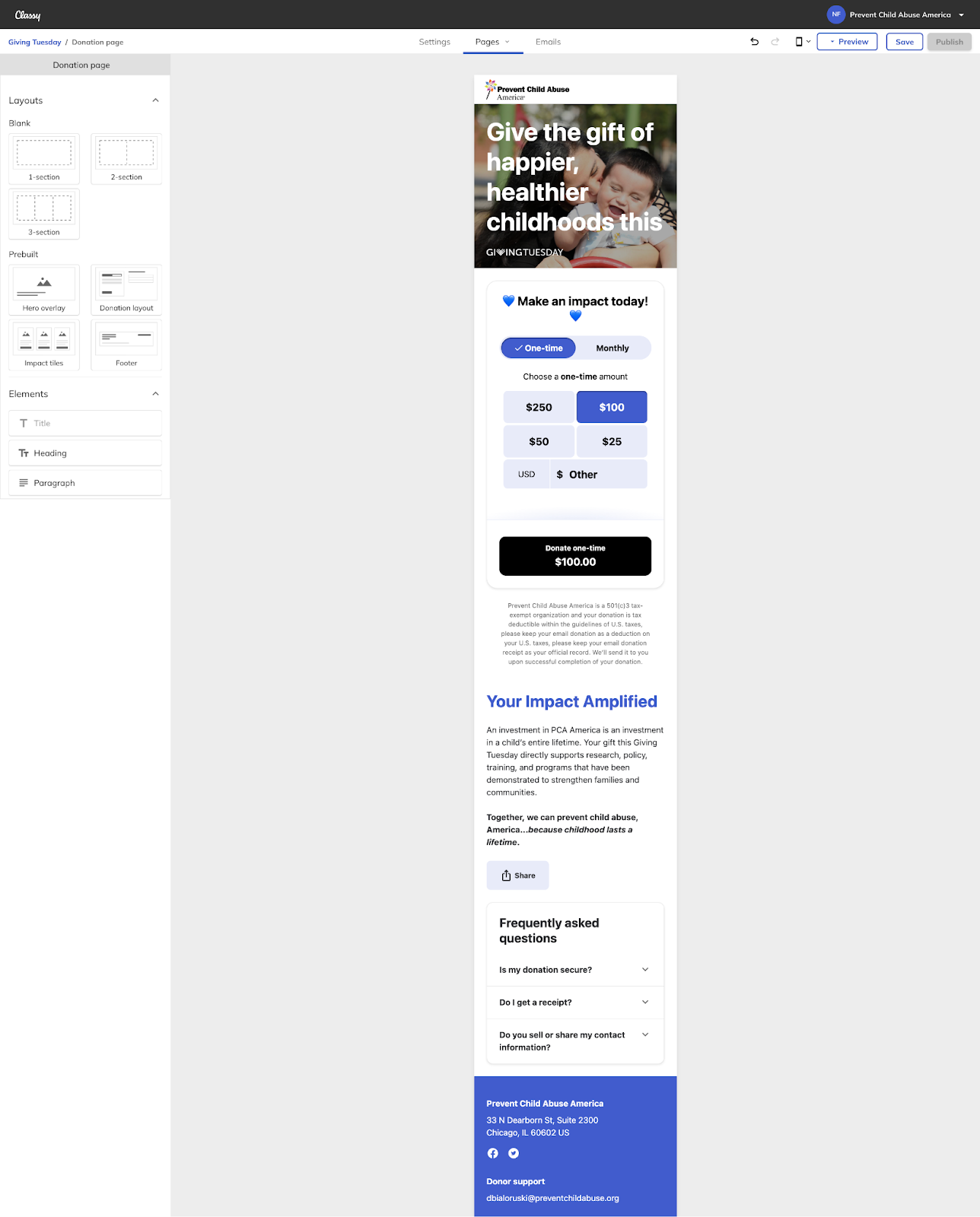
Prevent Child Abuse America uses Classy Studio to eliminate barriers between their campaign and donors who prefer to access it on a mobile device. The organization creates a streamlined experience for supporters with a header that serves as a warm welcome and leads them directly to donate.
Instead of scrolling through the entire page, the donation form placement helps people find what they want immediately. Those who want to learn more and keep engaging can immerse themselves in more storytelling to learn about the mission they’ll support.
Take It Up a Notch with Design Best Practices
If you feel inspired to continue maximizing your potential with Classy Studio, we want to help you unlock your inner designer with tips for any level of expertise.
Content Tips
- Keep content concise, avoiding walls of text as much as possible.
- State the purpose and impact of donations clearly with persuasive and emotionally engaging language to connect with potential supporters.
- Pair text with engaging visual content to evoke emotions and inspire action in our various layouts or layering options.
Image Tips
- Stick to valid image formats, including anything less than 2MB, to avoid increased load times for your campaign that lead to higher bounce rates.
- Prioritize and convert images to accepted file types (PNG, JPG, GIF).
- Use visuals wisely and lean into smaller images to keep your page from slowing down for users (stick with under 500KB, even though the limit is 2MB).
- Aim for a width between 1500px and 2500px for background images and a minimum height of 180px for logos.
Donation Form Tips
- Focus on your primary donate button to avoid distracting or overwhelming supporters. Adding other call-to-action buttons may confuse viewers about which action to take.
- Keep your donation page simple and straightforward to ensure the focus remains on the donation flow.
- Ensure all donation amounts on your donation form are accurate for one-time and recurring donations (the amount is customizable in your side panel).
Accessibility Tips
- Use high-contrast colors between text and backgrounds to make the content readable for supporters with low vision or color blindness.
- Use descriptive alt text for images that convey the meaning and context of the image to support screen readers for visually impaired users.
- Use different background colors and opacity options when using text over a hero image to ensure the text is clear and easy to read.
Layout Tips
- Check out how your design looks in mobile view and optimize the experience for supporters who prefer to access campaigns from their phones.
- Stick to a single option for all text or one font for headings and another for paragraphs.
- Use legible fonts and appropriate font sizes (at least 20px) to optimize readability for body text.
- Set your organization’s theme on each new campaign to maintain consistency and load your branding elements throughout the page.
Let’s See What You Create Next
Now that you’ve seen what Classy Studio has done for other nonprofits, we hope you have ideas about what experiences you can create for your community. The best part about Classy Studio is that each of these use cases comes alive when paired with your unique mission, branding, and story.
We’re here to help you see the potential of your fundraising efforts and remove friction between passionate supporters and a completed donation. As Classy Studio reaches more communities worldwide, we’ll continue to offer tips, advice, and successful nonprofit examples.
Copy Editor: Ayanna Julien
Optimize Performance with Classy Studio


