How to Create a Fundraising Page That Inspires Donations

A well-designed, branded fundraising page has lasting impact on donor behavior. They feel more comfortable and connected to the cause when they feel good about the sign-up experience. All those warm fuzzy factors have an effect on the “bottom line” of a nonprofit’s funding efforts and can help determine whether or not a registrant returns year after year to participate.
Here are three things you can do to make sure your fundraising pages hit the right notes.
Present a Strong Brand
First impressions matter: It takes just two-tenths of a second for a viewer to form a first impression of your website and just 2.6 seconds to decide whether they like or trust your nonprofit.
Creating an event page that is a rainbow of colors and an alphabet soup of fonts can paint your nonprofit as disorganized and distract from your cause. Instead, keep the look (think: logo, colors, font) of your registration pages visually consistent with your nonprofit’s branding. As much fun as it can be to go rogue, you want to make sure the viewer knows who is hosting the event and what purpose it’s serving.
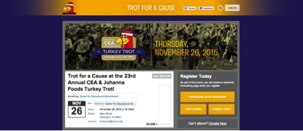
The Center for Educational Advancement (CEA) recently set up a branded event registration and fundraising page for their annual Turkey Trot run/walk to benefit individuals with special needs. In the snapshot of their event page below, the turkey logo reinforces the Thanksgiving Day theme, and the colors, font, and stylized photos embody the nature of this fall event.

Use Quality Photos That Tell Your Story
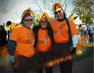
About 90 percent of information transmitted to our brains is visual. That means photos play a key role in communicating your mission. It’s important to use high-quality photos because they improve the viewer experience and help keep them engaged longer. Better yet, photos evoke emotion—and it’s emotion that helps people feel a connection to your cause, and ultimately moves them to register and fundraise.

Break Down Your Impact
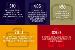
It’s human nature for donors to want to feel their gift is doing good. The best way to help donors understand the ripple effect of their gift is to break down the impact of specific dollar amounts into items your nonprofit needs to serve its cause.
Here’s a great example from CEA.

You want visitors to feel good about the entire process of registering, fundraising, and donating to your cause. It starts with strong branding that is reinforced with stellar photos and impact graphics like the one outlined above. All of these items come together to communicate your mission and improve your event and fundraising success.
Contact Matt at Matt@UpRaiseConsulting.com to learn how UpRaise Consulting can help you leverage the Classy platform to raise awareness and money online.
Read Next: 3 Pillars of a Strong Donation PageMatt Scott is the Chief Development Officer at CauseMic, Classy’s first Certified Strategic Partner in the nation. With Matt’s leadership, CauseMic has raised more than $6 million for their nonprofit clients on the Classy platform. Contact Matt on Twitter at @Cause_Mic to learn how CauseMic can help you raise money and awareness online.


