5 Design Tips to Distinguish Your Campaign From the Herd

When you need to knock your fundraising campaign out of the park, design is everything. Without it, it’s much more difficult to capture attention, develop trust, and incite action for your cause.
Yet, as websites continue to heighten the standard for great design, consumers’ expectations are raised as well. Today, it’s essential for your campaign design to not only meet this standard, but to truly “wow” your supporters.
But this goal begs the question, what does “good design” look like? Heidi Pun, owner and operator of Design for Founders, encourages organizations to view design as more than just visual aesthetics.
Good design is good for business. Measurable, profitable, and helpful for the customer.
This is easily adapted to your nonprofit. You want your fundraising campaign’s design to attract new supporters, elicit more donations, and encourage action from your community.
To help you create a campaign that visually delights and prompts your community to act, we’ve compiled 5 design tips that will take you to the next level.
Structure Dictates Everything
All great movies follow a structure designed to take the audience on a journey from start to finish. Along this path they’re given the information needed to understand what’s happening on screen, forge emotional connections with the characters, and find closure in the resolution of the film.
“Imagine your campaign as a movie and your supporters as the heroes of the film. Inspire their action through bold images, video, and text. Like great quotable movie lines, you want your design aesthetic to be easy to remember and share with others.
When juxtaposed next to a movie, your fundraising campaign isn’t that different. Design your page so that it takes your supporters on a journey where they learn the background of your nonprofit, the people involved, and the impact they stand to make through a donation.
Also like a good movie, you have to structure your campaign so people don’t get lost or confused. Most designers support the idea of building a hierarchy that guides the audiences’ eye from top to bottom, hitting everything in between.
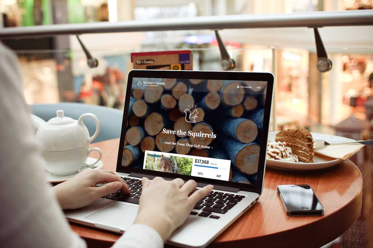
Classy’s new Fundraising Suite has this concept of hierarchy built in, but this is the standard approach:
- A company logo in the header
- A large hero image
- A call to action to “donate now” on a button, paired with a fundraising progress bar
- Relevant information about the organization and the campaign
- Impact blocks that explain how donations specifically help
- Additional background information about the organization
- Fundraising campaign activity, such as recent donations
- A footer with contact information and branding
As Terry advises, you want your fundraising campaign to be memorable and shareable—like great movie lines. However, without a structure, your campaign becomes garbled, hard to remember, and not shareable.
When the design hierarchy is built in, you can spend your design efforts executing other parts of your page like font, color schemes, visual effects, and images.
Three Fonts is All You Need
Many designers claim that typography is 95 percent of all design. As such, the font you choose could potentially influence 95 percent of your entire campaign aesthetic. The decision to select the right font can seem overwhelming, though, when you have so many options.
The difficulty isn’t in choosing between Times New Roman or Calibri. Rather, it’s choosing a font that aesthetically lines up with your brand logo, colors, and fundraising campaign message.
For example, you likely wouldn’t want to use the font Impact if your fundraising campaign revolved around finding homes for abandoned animals. It’s hard, bold, and comes at you full force.
In this example, you might consider a font with more breathing room around the letters, like Verdana, which has a much lighter feel to it.
Heidi Pun recommends two fonts for your page, but you can get away with three. Just remember, the more fonts you use, the more disjointed and confusing your page can appear. Use a different font for:
- The hero block
- The headlines
- The body copy
It provides your text with a cleaner design that helps the flow of your campaign hierarchy from top to bottom. Currently, the Classy platform has seven fonts to choose from for a consistent page.
Cap your selection at three to ensure your audience has a smooth and positive reading experience. Whatever you select, the font you choose will influence the emotional feel of the story you tell, as will your campaign colors.
Choose Complementary Colors
Colors convey specific emotions. Similar to fonts, you want to make sure you’re strategic with your selection and limit the number you use. To avoid overwhelming or confusing a visitor on your campaign page, use two to three colors for your site, and five at maximum.
To identify which colors to use, it’s important to consider color schemes that work well together. For example, lime green, mustard yellow, and neon pink on the same page isn’t likely to please the eye.
“It’s not just about making something look good, but making it make sense. Design is basically visual problem solving. Always think about the purpose of your fundraising campaign and put yourself in the shoes of your audience.
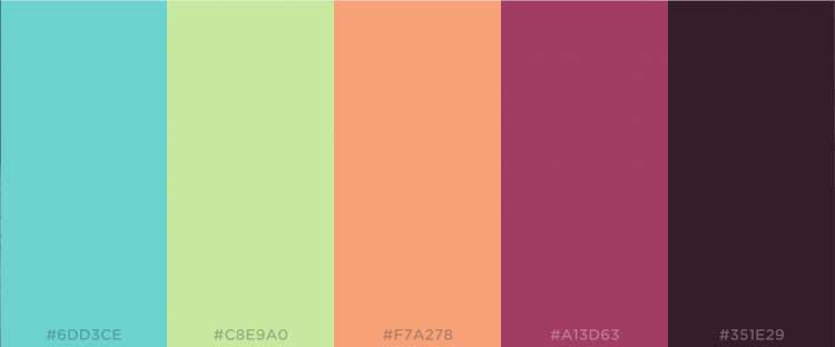
There are ways to ensure your colors make sense when put together and contribute to the overall theme of your campaign. Consider how the colors you select might tie back to your organization, and turn to a color scheme generator, like Coolors.co or Adobe Color CC, to find sets of complementary colors.
No matter what color scheme generator you use, there will be a hex color code attached to each color.

With the new Fundraising Suite, you can copy and paste the hex color code identifier to quickly incorporate it into your page.

Paint your campaign to match the emotional feelings you’re going for. This helps you tell your story more effectively and drive more engagement from your supporters.
Effects Need to be Subtle
As you design your fundraising page and tweak the colors and effects, the word you want to keep in the forefront of your mind is subtlety. The subtler the effect, the cleaner your design aesthetic.
Remember, your fundraising page needs to take your audience on a journey that’s direct and to the point. Like colors and fonts, you want to air on the side of simplicity with visual effects so your main message doesn’t fade into the background.
Given recent trends in design, Classy’s new Fundraising Suite incorporates three popular visual effects of image opacity, blur, and background color. We recommend sampling one or two of these effects to make certain parts of your campaign standout over others.
Another design trend that the Classy platform capitalizes on is the fixed and cover effect, which you’ll notice on most websites. It keeps the background image fixed in place while the foreground color blocks and text scroll over it, or cover it.
Also, don’t forget about negative space, or white space. This is the use of empty space as a design tool to draw the eye’s focus to certain elements of your campaign page, like specific images.
Your Images Define You
Just as important as any font, color, or visual effect, are the images you populate your page with. Never build a page without high quality images that embody your nonprofit’s message.
“While content is king, design must make it effortless for a visitor to grasp that content. Tell your story, but don’t belabor them with paragraphs. Use photos and graphics to evoke the concept and emotion of your mission. And if you don’t have a designer, there are plenty of resources like Pixabay, Pikwizard,Pexels, and Creative Market that provide access to great designs for little to no cost.
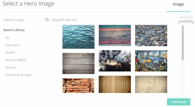
Classy has integrated Pixabay, a library of free and licensed to use photos, into the new Fundraising Suite to help you find images that align with your mission.

Further, any image you have in your personal library can be uploaded directly to either the header or hero image slots, and directly into body text blocks. And for a little extra spice, you can also upload GIFs in any place you can upload normal images—they even work with the fixed and cover scrolling.
To bring it back to the film metaphor, consider your images as the leading role in the movie. These are what draw people in at first glance to commit the time, energy, and effort to pay attention to what you’ve produced.
From structure all the way through fonts, color, visual effects, and images, every design element on your page works in unison for the benefit of your audience. Regardless of your end goal, these design tips will help drive your constituents to take action.
The new Fundraising Suite gives you the creative control to design your movement from top to bottom. Interested in learning more? Sign up for a free Classy account today and try it out for yourself.

How to Design a Stunning Campaign Page on Classy


