The Ultimate Guide to High-Converting Donation Forms

Your nonprofit website is the gateway to fundraising success—every visitor counts. A seamless, embedded donation form keeps them engaged and inspired to give.
Yet, many nonprofits don’t realize that friction and impersonal experiences on their current donation forms may limit their ability to convert more visitors into donors.
The good news is that the right donation form builder and functionality can get through this barrier, boost donor engagement, and help you raise more.
Explore Embedded StudioWhat makes a donation form effective?
A high-performing donation form keeps the donor experience top of mind.
Here’s what sets the best ones apart:
- User-friendly design
Studies show that simplifying forms can boost conversion rates. One study found that reducing form fields from 11 to 4 led to a 120% increase in conversions—backing our rationale for an embedded donation flow as short as four steps. - Speed
Fast-loading pages ensure that donors don’t abandon their gifts out of frustration. Optimized donation forms minimize wait times and streamline the process while increasing your chances of healthy search engine rankings. - Minimized distractions
A donation page should keep visitors focused on completing their gift. Removing unnecessary links or competing calls to action ensures they stay on track. - Mobile optimization
With an increasing number of donations coming from mobile devices, a mobile-first design is crucial. A great donation form automatically adjusts to different screen sizes, ensuring a seamless experience across devices. - Versatile payment options
Offering flexible payment methods—such as credit card, ACH, PayPal, Venmo, and digital wallets—reduces barriers and makes it easier for donors to give in the way that’s most convenient for them. - Personalization
Aligning your donation form with your nonprofit’s branding creates a seamless, trustworthy experience. The personalized imagery and messaging that brought a donor to your page should carry through the entire process, helping inspire them to complete their gift. - Impactful prompts and giving nudges
Personalized prompts—such as reminders for recurring gifts, fee coverage options, or abandoned cart notifications—encourage the giving you want and increase conversion rates. - Integrated across all pages
Embedding a donation form on your main donate button is key, as it’s the most prominent spot. However, adding donation entry points in-line across various pages allows supporters to contribute when they’re most inspired, no matter where they are on the site.
Why nonprofits trust Embedded Studio donation forms
Embedded Studio takes the guesswork out of designing effective donation forms by providing nonprofits with a tested, powerful, and easy-to-use tool.
Here’s why it stands out:
Data-backed design
Embedded Studio’s proven layouts and research-backed design elements help maximize conversion rates.
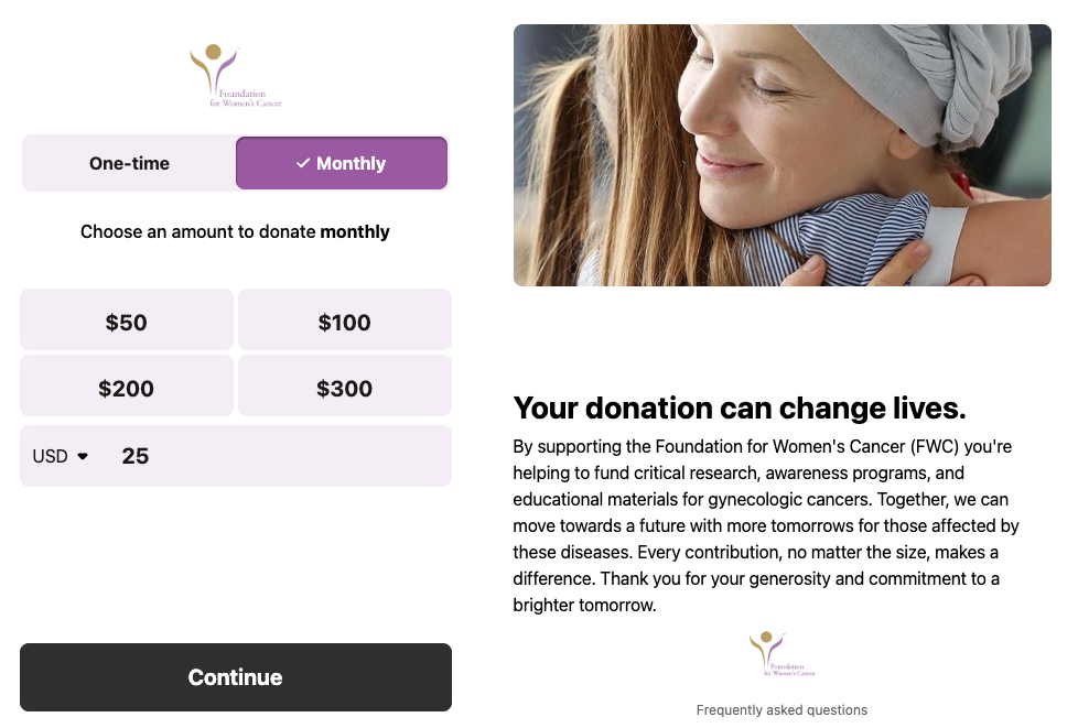
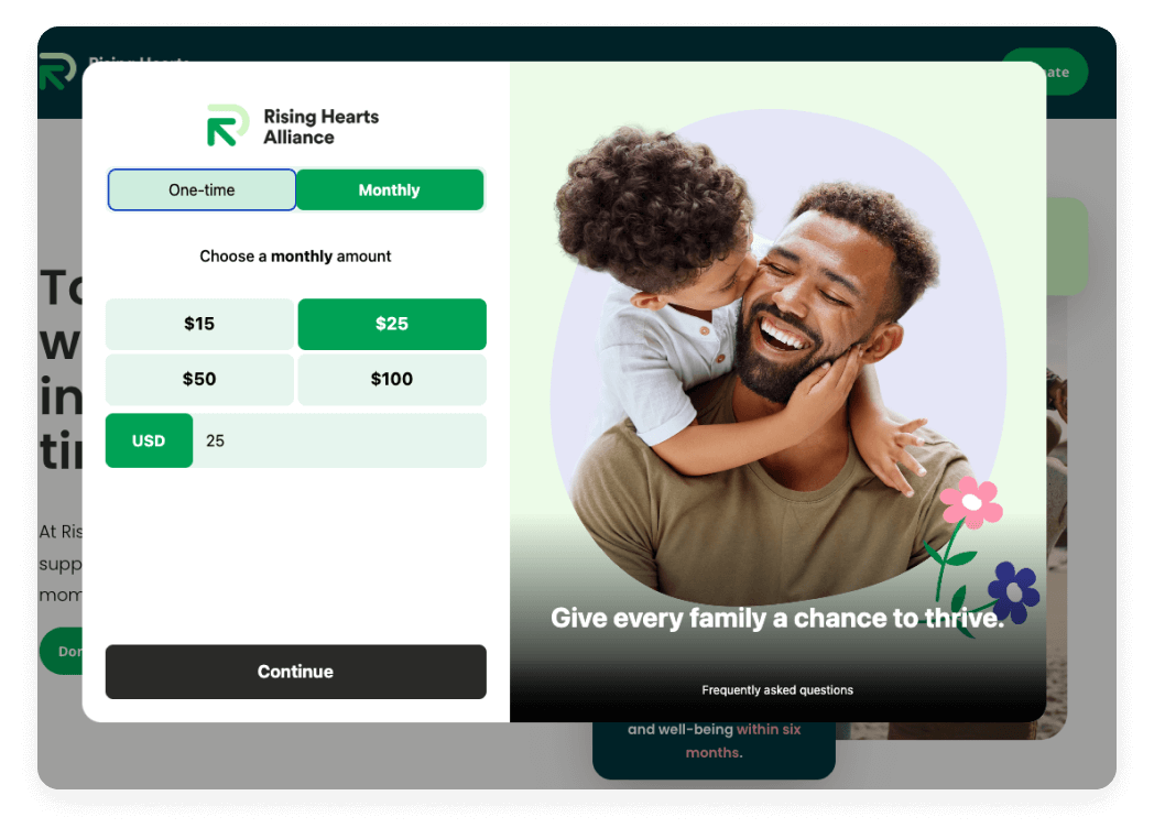
Our high-performing pop-up design keeps donors focused on giving, no matter the device. It maintains your branding, provides access to FAQs, and allows easy navigation—all without distracting from the primary goal: completing the donation.
Additionally, our testing reveals that a black Continue button enhances focus, seamlessly guiding supporters through the donation process. This design choice drives more gifts and ensures your forms meet the highest accessibility standards, although you may choose to edit this color if you wish.
The Embedded Studio form for the Foundation for Women’s Cancer incorporates these trusted design elements, providing donors with the most efficient and impactful donation experience.

The Embedded Studio donation form has greatly improved the donation experience for our supporters, who have praised its modern look and ease of use. The pop-up box allows supporters to give without needing to navigate away … from the page they were viewing.
The Embedded Studio donation form has greatly improved the donation experience for our supporters, who have praised its modern look and ease of use. The pop-up box allows supporters to give without needing to navigate away … from the page they were viewing.
Comprehensive functionality
Embedded Studio includes everything nonprofits need to create high-performing forms. Nonprofits like the Mission Kids Child Advocacy Center are already seeing the results of using these proven features to fuel their impact.
What features can I expect with Embedded Studio?
Embedded Studio provides a robust set of tools and features to enhance your donation experience.
Here are a few:
- Flexible giving options allow donors to choose between one-time and recurring gifts
- Customizable input fields enable you to collect key donor details—like payment preferences and optional addresses—after the donation is complete, helping streamline checkout while keeping the process distraction-free
- Program designation and tribute donation options allow supporters to direct their gifts in meaningful ways, enhancing donor engagement
- Employer-matching capabilities to amplify the impact of each dollar
- Personalized nudges, including prompts for donor-covered fees, to help increase giving
- Social sharing capabilities empower donors to amplify their impact
- Expandable FAQ links keep supporters informed without leaving the checkout flow
- Behind-the-scenes analytics tools like Google Analytics 4 provide valuable insights into donor behavior, enabling organizations to refine their fundraising strategies

Seamless integrations
Connected fundraising experiences are critical for nonprofits seeking to optimize their efforts. With Embedded Studio, nonprofits can effortlessly connect their donation forms with essential tools that streamline operations and strengthen donation outcomes.
Whether your organization needs to track campaign performance, personalize the donor journey, or simplify the giving process, Embedded Studio delivers a robust, user-friendly solution:
- Compatibility with all website builders, and WordPress users can simplify setup even further with our dedicated plugin
- Global donation capabilities with Passport
- Customer relationship management integrations like Salesforce, Omatic, and Virtuous
- Seamless connections to top payment processors for smooth transactions
- Google Tag Manager and Google Analytics 4 for tracking campaign performance
- Social share buttons to encourage donor engagement
We’ve had a fantastic experience using Embedded Studio—it’s been an incredibly seamless and intuitive tool for our campaigns.
No-code design
While a one-time code setup is necessary for the launch, once it’s in place, nonprofits can easily brand, design, and edit their donation forms without any technical expertise. This solution removes the barrier of relying on highly trained staff, enabling quick updates and adjustments without slowing down fundraising efforts.
This flexibility empowers your nonprofit to stay agile, ensuring your forms remain up to date and aligned with fundraising goals.
The Storehouse Community Center successfully branded its donation form using our no-code design tools by incorporating its colors, logos, and personalized text and images. This customization not only enhanced the donor experience but also ensured consistency with their overall brand.
Additionally, they saved time and reduced costs associated with site updates, all while maintaining a seamless, user-friendly donation process.

The customization options in Classy Embedded Studio allow us to personalize the pop-up to match our brand visuals, creating a cohesive experience that builds trust with our supporters.
Easy steps to get started
Now that you’ve seen what’s possible with Embedded Studio, we want to make the next steps as seamless as possible. To get started, customers can easily request a predesigned donation form template from our campaign catalog, which incorporates all our research and optimizations.
Transform your fundraising
A well-designed donation form is one of the most powerful tools nonprofits can use to drive gifts and increase donor engagement. With Embedded Studio, you get everything you need to create stunning, high-converting forms that make giving effortless.
Already a Classy customer? Attend one of our biweekly Embedded Studio trainings for step-by-step guidance on designing your next standout form.
If you’re not yet a customer, request a demo or explore our pricing packages as a first step to optimizing your nonprofit donation form with Embedded Studio.
Copy editor: Ayanna Julien

Make giving from your website as easy as it is personal


