5 Donation Page Examples and Winning Strategies to Optimize Your Fundraising

An optimized donation page can make all the difference in turning a potential supporter into a committed donor. But great donation experiences don’t just process transactions. They build trust, reinforce your nonprofit organization’s mission, and make giving easy and meaningful.
Whether someone lands on your online donation page from an email, social media, or donation button on your nonprofit website, a seamless experience that aligns with your brand and simplifies the giving process is key to driving more completed donations.
In this blog, we’ll explore best practices for creating high-converting donation pages using Classy Studio and highlight standout examples from nonprofits that get it right.
Free donation page checklist5 nonprofit donation page examples to emulate
By following a few key donation page best practices, you can effectively encourage one-time and recurring donations. Let’s explore five outstanding donation page examples, along with simple, actionable tips that you can implement right away to improve your fundraising campaigns and start driving more donations.
1. Put yourself in your busiest potential donor’s shoes
A donor’s time is precious, so clarity and brevity are key. They need to quickly understand:
- Your organization’s story
- Why they should give
- The impact of their gift
Classy from GoFundMe’s impact tiles are a helpful tool for emphasizing the value of every dollar. By showcasing the tangible outcomes of each suggested donation amount, they help donors understand the real-world impact of their contributions and feel more connected to your organization’s work.
Additionally, ensure your experience is mobile-friendly, as more and more donations come from mobile devices (mobile users make up over 62% of web traffic). Don’t make them wait for the page to load, either—speed matters.
Lastly, offering flexible, secure payment options, including digital wallets, empowers donors to give in the way that suits them best. Meeting their preferences with quick, easy payment methods is key to driving conversions.
See it in action with Classy Studio
After initial success throughout the year with Studio, the Lucile Packard Foundation team incorporated the donation page builder into their Giving Tuesday campaign.
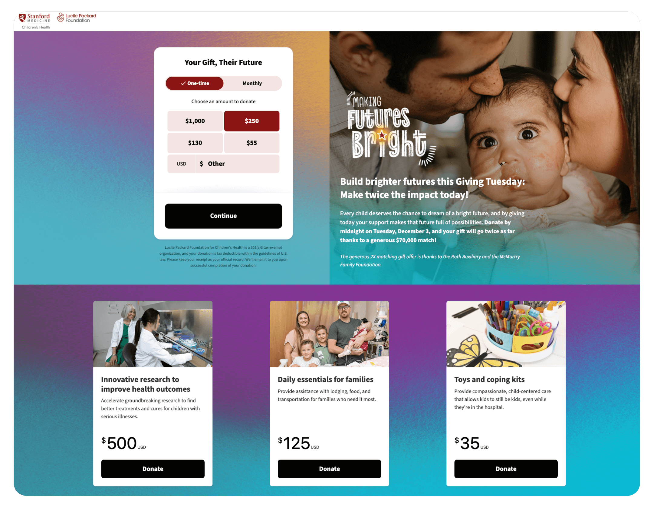
In 2024, the nonprofit’s team crafted a compelling year-end campaign theme, “Making Futures Bright,” and focused on rich content and imagery that featured three powerful Patient Hero stories, one of which they highlighted on Giving Tuesday. Additionally, the Lucile Packard Foundation team leveraged impact tiles to clearly explain the value of each dollar amount.
The outcome? On Giving Tuesday, the Lucile Packard Foundation raised 44% more year over year and saw a 44% higher average gift amount than the overall average for the year.
One of the benefits of Classy Studio is that we can tell a story and drive donations on a single page, so we’re not getting drop-off from people who don’t click through to the donation form from a traditional landing page.
2. Personalize every touchpoint
Personalization is essential for donor engagement, but how does that translate to your fundraising efforts?
One way is to create customized versions of your donation pages, perfecting the messaging based on the specific cohort that sees it. This ensures every donor feels like they get a tailored experience, whether they’re a first-time visitor, a recurring donor, or a supporter of a specific online fundraising campaign or event.
Additionally, a powerful end-to-end message throughout the donor journey plays a key role in deepening a donor’s connection to your cause. By maintaining consistent communication across all touchpoints—whether through your website, donation page, or email—you build trust and familiarity with your supporters.
However, consistency doesn’t mean a one-size-fits-all approach. It’s critical to personalize these communications to the channels that make the most sense for each returning or new donor. Whether it’s an email, text message, or social media post, delivering the right message via the right channel at the right time increases the chances of a well-received message.
Tailoring your approach to meet the donor where they are—based on their preferences and behaviors—further strengthens the relationship and encourages ongoing support for your mission.
See it in action with Classy Studio
On Giving Tuesday 2024, Joni and Friends added a pop-up to its homepage, which led directly to a Studio campaign. To optimize the campaign, the Joni and Friends team used source codes to better understand the performance on different channels, helping to inform the user experience for future campaigns.
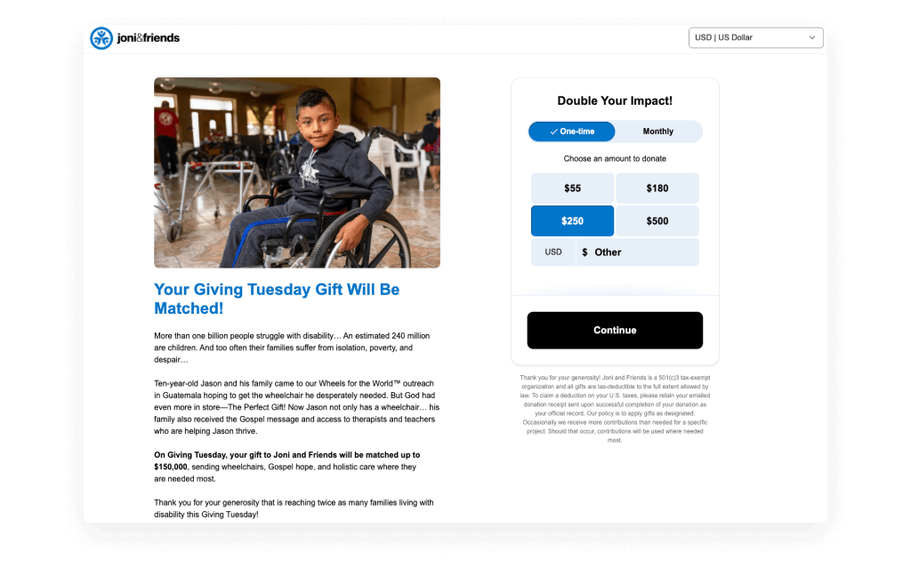
When a supporter decided to make a gift, whether a one-time or monthly donation, the Studio checkout process was only a few short steps and kept them on the same page. In addition, the Joni and Friends team mastered the donation follow-up strategy, which includes personal touches and automated nudges—easy-to-add custom elements in Studio.
With this personalized, high-performing Studio campaign, they raised 121% more than the previous year and increased the number of gifts by 37%.
With Classy Studio, we could quickly create our Giving Tuesday campaign and customize it exactly how we wanted without needing a developer to step in.
3. Leverage your community’s strength to drive bigger results
Powerful impact is driven by community—when people come together and rally their networks to achieve a common goal. For an effective donation page, it’s essential to tap into this collaborative model.
Start by creating a sense of urgency so donors know why they should act now. Pair this urgency with a progress bar and sponsor matching to show movement toward the fundraising goal, which can be incredibly motivating for potential donors and their networks to get involved.
Social proof also plays a key role in building trust, showing that others have already committed to the cause. An activity feed can be especially impactful in this regard, highlighting recent donations and encouraging others to join.
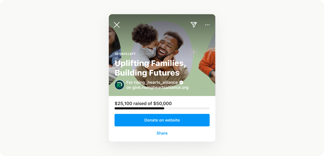
To further enhance your page’s reach, ensure it’s easily shareable and discoverable. Our first-of-its-kind Meta integration enables seamless social sharing, empowering supporters to share the page to their Instagram stories and Facebook feeds with one click, boosting visibility and helping you engage a wider audience.
See it in action with Classy Studio
With such an impressive social following (134,000+ followers on Instagram alone), the Austin Pets Alive! team wants to maximize the channel their supporters interact with the most.
Classy’s direct integration with Meta empowers donors to give back and give forward with dynamic social sharing tools, which will power more lifesaving work throughout the year.
This integration will also make it easier for the Austin Pets Alive! team to track which donors come in through that particular channel since the donation checkout flow collects the same data as any other Classy donation form, a challenge many organizations have faced in the past on Instagram.
Read the full story4. Empower donors to expand their gifts
A key to raising more for your cause is expanding the potential of each donation appeal.
Offering a recurring giving option is one effective way to do this. According to GoFundMe’s fundraising platform data, recurring donors are 9x more valuable than one-time donors, and 25% of them return to make an additional donation within the same year.
However, creating an impactful recurring giving experience goes beyond adding a recurring gift button. It’s about giving supporters control over how often they give—whether monthly, weekly, annually, or on another schedule that works for them—increasing the likelihood of long-term commitment.
You can also inspire donors to fill their philanthropic “shopping carts” using Giving Cart’s e-commerce-like functionality, which makes it easier to select multiple online giving opportunities. On average, 17% of Giving Cart supporters donate multiple gifts compared to non-Giving Cart campaigns.
See it in action with Classy Studio
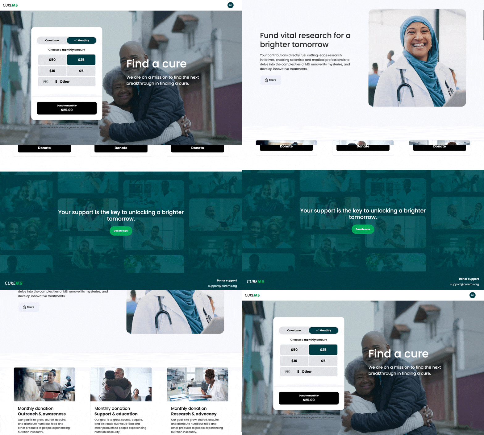
When Classy released Giving Cart, the City of Refuge team was one of the first to raise their hand. The tool’s flexibility allowed them to add a portfolio of gifts that their supporters could add to their philanthropic carts, such as:
- Supplies for a teacher
- Supplies for a student
- After-school programming
- One-time donation
- Monthly donation
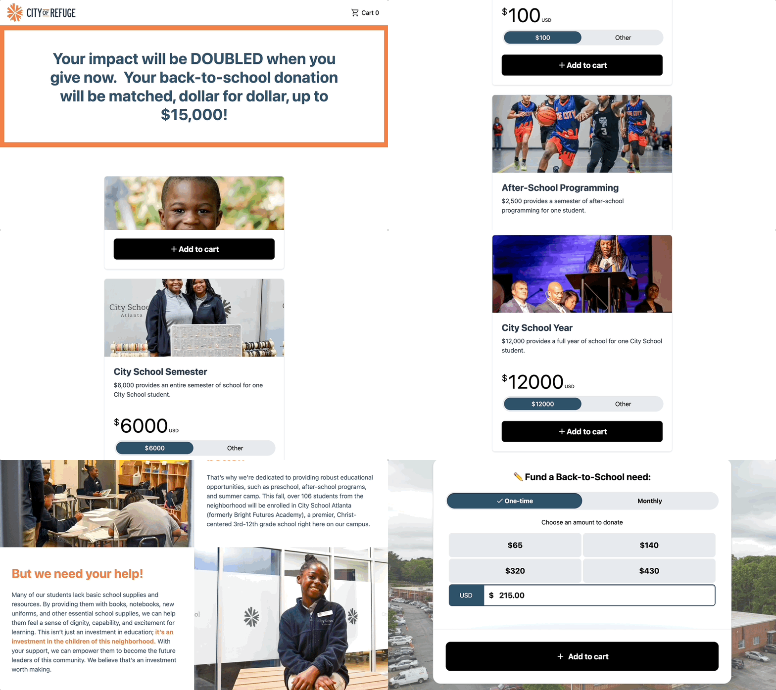
The City of Refuge team raised over $45,000 in one month, providing 300 new pairs of shoes and 300 new backpacks filled with school supplies to students who needed them.
Giving Cart helps us show donors the impact they’re having, which inspires more connection and giving.
5. Test everything
A golden rule is to test every step of the donation process through your fundraising software before launching. By testing, you can make optimizations based on what works and what doesn’t, like tweaking your donation page design or call to action for higher conversion rates.
At Classy, we take this approach to continuously optimize our solutions for nonprofits. Our research hub showcases some of our large-scale tests, ensuring you get the best solutions automatically. You can also run tests of your own, like Khan Academy.
One example of this scaled testing is our launch of Intelligent Ask Amounts (IAA). During the 2024 giving season, donors presented with IAA gave 4-7% more in donation revenue compared to those who saw a standard ask array, with larger average gift sizes driving this increase.
Explore other tests we’ve conducted to shape our Classy donation pages and discover how we’ve developed proven layouts based on 15 years of fundraising expertise across Classy and GoFundMe.
Stay ahead with an optimized Studio donation page
Your donation page is one of the most crucial elements in your fundraising strategy. Whether refreshing an ongoing campaign or optimizing your evergreen donor experience, it’s essential to stay current with best practices and tools that drive results.
With Classy Studio, you can easily elevate your donation page to meet the latest standards, ensuring it’s user-friendly and fully optimized for donor engagement and conversion. For more real-life examples, check out our online fundraising inspiration hub.
Ready to improve your donation page? Sign up for our next Studio training or request a demo to learn how we can help you create the best donation page experience for your supporters.
Copy editor: Ayanna Julien
Nonprofit donation pages, your way


