6 Ways to Make Giving Easier with Embedded Giving

Every visitor of your nonprofit website is a potential donor.
Get ready to turn passive supporters into donors with a donation experience that streamlines the checkout process. We found that Classy customers using an embedded checkout form during giving season saw up to a 28% improvement in revenue per site visitor.
As mobile traffic increases across our platform, embedded giving is an incredible tool to help simplify the mobile donation experience and urge supporters to complete their donations. You can start with a simple and mobile-optimized checkout form, which we’ll walk you through below.
Explore Embedded Donation Forms

What Is Embedded Giving?
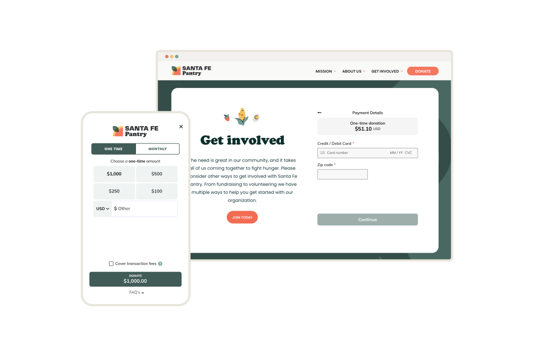
Embedded giving experiences provide website visitors with a complete donation form without leaving your site for a separate donation page. Instead of needing to click on a separate donation page to start their transaction, they can begin right away on your home page.
There are two different ways of approaching embedded giving:
- Modal embeds or pop-up donation forms that display when people select your donate button
- Direct (or in-line) embeds where you place your form on a page in-line with other elements
We developed Classy Embedded Checkout from standard Classy donation forms, so nonprofits get many of the same benefits they’re used to on the Classy platform, from branding to donor tracking.
The ROI Nonprofits Gain From Embedded Checkout
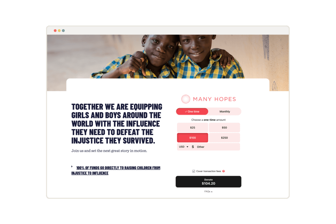
When nonprofits focus on what modern donors want to see, they see results. Many Hopes turned to Classy’s embedded checkout forms to bring their own custom-giving experience to life for their supporters on any device they choose.
Here’s a glimpse at what Many Hopes achieved between December and April of 2021, and the same period in 2022:
- 56% YoY increase in donation volume
- 53% YoY increase in individual donors
- $975 average gift size using the popular payment option, PayPal
Classy’s embedded donation forms allowed us to keep users on our page so they wouldn’t have to switch to another domain, reducing the friction points.
We’ll walk you through some easy ways to set up your embedded giving experience so you can achieve similar results.
5 Ways to Make Giving Easier With Embedded Giving
A good donor experience provides a great first impression. Delight new donors with embedded giving, and offer a reliable process that long-term supporters are happy to come back to. When you take away the confusion of where to navigate on your donation sites, you’ve already increased the chances of a completed transaction. Here are a few other tips to help you make the most of embedded giving.
1. Hook Visitors With an Attractive Look and Feel
Modal donation forms feel modern and showcase the simplicity of the minimal-step process right away. Branding your donation modal to match your website helps donors feel like they’re never leaving that experience. The consistency also shows them that you’re professional and trustworthy.
It’s also helpful to include your donation modal alongside a strong narrative. Highlight the impact of your work and provide them an avenue right then and there to join your cause. As people become more passionate about what their donations are accomplishing, they may also be more likely to share it. Word-of-mouth is how 67% of donors were most likely to find out about new causes in 2021.

Quick Tip
When you’re building your donation modal, bring your brand to life. Mirror the look and feel of your website by selecting from your brand’s color palate and language, as Many Hopes did in the example above. You can set it up with a self-serve option, using very little code, so it’s simple to get up on your site.
2. Empower Donors to Use the Device of Their Choice
It’s far less likely that donors would opt out of a donation opportunity when they feel familiar with the purchasing process. Think about the experiences surrounding donors daily with modern services and brands using intuitive apps. Now imagine you can offer donors a similar experience when they come across your site on their phones.
In 2021, most campaign types on Classy saw over half of the donor traffic come from a mobile device. Open your donation process to support mobile donors so you can capture all the people who land on your page. It’s important to consider how easy it is to donate while people are balancing work schedules, travel, or other moments of their on-the-go lifestyles where a desktop is not accessible.
Quick Tip
Look at how much traffic your campaigns typically receive from mobile devices or tablets. Consider directing donor traffic from social media platforms or physical QR code advertisements to the page on which you embed your donation modal to continue the seamless mobile experience.
3. Make Payments a Breeze
Like consumers, donors light up when they see a way to save time with a trusted payment option. Modal donation forms sync up to apps that likely already store their information, such as PayPal, Venmo, Apple Pay, or Google Pay. Donors also told us that a top reason they would reconsider a donation is if their preferred payment option isn’t available.
People like easy. Boost conversion for mobile traffic by clarifying that you offer the mobile payment they want to use. Nonprofits saw mobile conversion improve by more than 2 points after activating Venmo on Classy Pay in 2022.
Different payment options also broaden your reach to audiences across younger generations. We saw that 72% of millennials selected PayPal and Venmo as their preferred payment options. Those numbers demonstrate the value of simply having these logos greet them on your checkout modal.
Quick Tip
Include the payment options that your donors resonate with most. Elevate different gift amounts and frequencies to be accessible for varied financial situations. When you use Classy’s embedded checkout, you can feel confident donors have the most optimized user experience, avoiding payment fatigue.
4. Nudge Donors to Complete and Uplevel Their Donation
We’ve all become distracted during the online payment process, abandoning our cart to respond to a text message or another notification. Globally, the average shopping cart abandonment rate is 71.49%, with e-commerce brands losing an estimated $18 billion in revenue.
Consider how many donors land on your donation page and begin the checkout process to then get distracted because they don’t have their credit card on them or they’re late for an appointment. Setting up cues or nudges that remind the donor of their intended donation is important to recapture the donor’s attention and guide them back toward their cart.
Nudges can also persuade donors who select a one-time donation to become recurring donors instead. We’ve seen how valuable recurring donors are in creating predictable revenue for organizations. In fact, the average one-time gift is about $168 on Classy, and the average monthly recurring gift is $30. While the recurring gift size is smaller, recurring donors typically give for one to three years. One year of a $30 monthly donation would bring in $360—roughly 2X the average one-time gift.
Quick Tip
Activate Classy’s Abandoned Cart Nudge and Recurring Nudge for your embedded checkout so that donors are more likely to complete their donation and become recurring donors.
5. Simplify Employer Matching
A donor wants to make the most significant impact on your cause or a challenge you’re looking to solve. When you can offer to double their donation, that impact is even more enticing.
Employee donation matching encourages workplace giving. It also broadens awareness of your cause among larger organizations that can become corporate sponsors, volunteers, or major donors down the road.
Check Out Companies Offering a Match
Offering an employer donation match option on your donation modal gives donors a quick way to see if their organization can match their contribution. It can also be a great tool to prompt timely giving. Most visitors see the donation match as an opportunity to make the biggest difference toward your cause.
Quick Tip
Integrate a matching gift tool into your embedded checkout experience to prompt donors to search for their employer to match their donations. Stay up to date on how Classy is offering more capabilities with partners like Double the Donation.
6. Bring Recurring Giving Opportunities Into the Spotlight
We already know donors love choices, but especially when their financial circumstances may shift, an option to automate a smaller gift over time can be appealing. Did you know 56% of donors feel a recurring gift enables them to continuously support the organization, and 47% like the option because it makes more of an impact?
A recurring donation option on your modal donation form puts the option right in front of donors who might not have known it was possible. Donation pages already bring in the most average recurring revenue; including regular giving on your donation modal can yield excellent results.
Quick Tip
Present your recurring gift option with various giving frequencies to appeal to any donor’s financial situation. Classy lets you offer monthly, weekly, daily, bi-weekly, quarterly, and annual options all on the same form. This way you can put the power in your donors’ hands, and the predictable income in yours.
Learn About Donation Frequencies
Get Started With Embedded Giving on Classy
Are you ready to delight your donors with a modern giving experience? We hope you see the value in offering this simple option that only takes a few steps to set up. Bring your website visitors into your donor community, and stay up to date on new donation modal updates from Classy to continue to raise more for your cause.

Simplify Giving With Embedded Donation Forms


