Excite Engagement with Visual Giving Levels

A list of suggested giving levels is a common feature among many nonprofits’ donation forms. Give $25, $50, $100. But a visual of your different donation amounts? Now that can kick up your visual storytelling a notch.
On top of engaging your donors and demonstrating the impact of their contributions, it’s a piece of content that can be easily digested and shared by your supporters. Tweets with images are nearly twice as likely to get retweeted. Having this visual handy is yet another opportunity to generate social shares and drive traffic back to your website.
We understand not every nonprofit has an in-house designer that can focus solely on whipping up an awesome graphic for their giving levels. However, there are a number of easy and cheap tools available online that can boost the quality of your visual content and draw in your donors.
To help you get inspired, we poked around the Internet and found 3 examples of nonprofits that are using visuals to encourage donations at particular levels, along with takeaways and free resources for each one that can be employed in your own visual content creation.
1) Liberty in North Korea
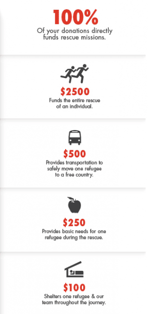
LiNK shares a simple and appealing graphic for different donation amounts on fundraisers’ personal campaign pages. Not only is the information uncluttered and easy to read, but it is also arranged in a way that follows the eye’s natural course. And because the graphic’s design is consistent with the look and feel of LiNK’s other visual content, the organization’s branding gets shared along with the information.
The Takeaways
- Clean, simple, and easy: Notice how a simple pairing of icons and text can make for a good graphic recipe. Maintain your branding by aligning your visual with your organization’s explicit branding elements, such as color scheme and font style.
- Free Tools: What’s even better is that you don’t need Photoshop to whip up this kind of graphic. PowerPoint as a very easy alternative for putting together image and text. If your organization uses Google apps, you can also use Google drawingsto easily create custom, polished visual content, including shapes and text you can overlay onto your procduction. And just like Google docs, you can edit drawings online in real time with another user.Some other tools you can try:> Pixlr
> Pictochart
> Infogram
- Icons: Again, no need to be a designer to create polished graphics. Downloaded icons may not be über-customized illustrations, but they’re good-looking and effective. Hubspot offers an awesome collection of 135 resizable icons you can use in your marketing collateral. The best part is that it’s free!
2) Team Rubicon
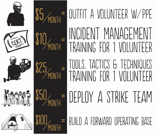
Team Rubicon launched their Eleven11 campaign to raise funds for their disaster relief efforts, and they used this awesome graphic to suggest monthly donation amounts. This was an especially great idea for a recurring donations campaign. Because supporters might not be able to make the connection between a monthly donation and its long-term impact, providing a visual is an excellent way to tangibly connect the dots for donors.
The Takeaways
- Sprucing up your imaging: If you have the time and resources, creating personalized icons can make your graphic slightly more nuanced. If you’re also looking for a more sophisticated (but just as easy to use) alternative to PowerPoint or Paint to create your visual, consider Infogr.am. This free tool specializes in interactive infographics and data visualization. Non-designers can create charts, edit data, insert text and even display video to create a professionally designed visualization in minutes. Infographics also include sharing and embedding capabilities, making it even easier for you and your supporters to spread your content.
Canva is another free resource that takes the design-illiterate and transforms them into master graphic artists. In addition to being able to add your own imagery, you can manipulate and choose from the program’s extensive collection of pre-made templates, icons, layouts, and assets. Here’s my work in progress, only 5 minutes in:
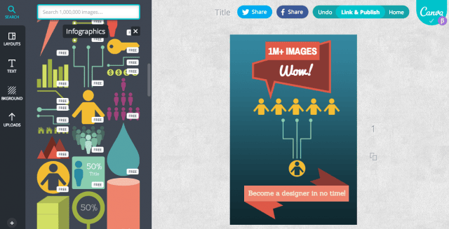
A huge number of Canva’s graphics are free, although you can purchase more premium graphics and assets for just $1.
3) Pencils of Promise
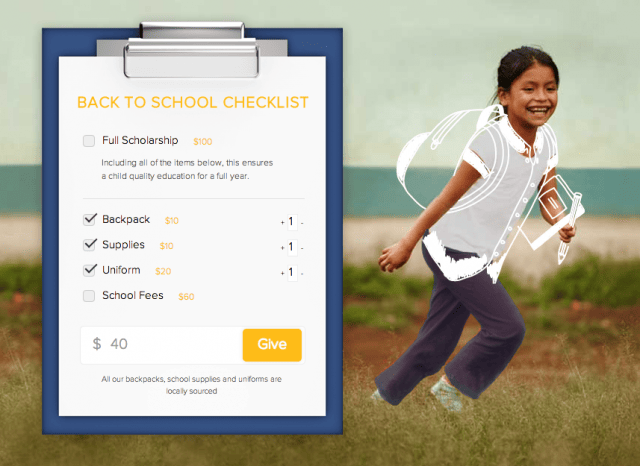
For their “Back to School” campaign, Pencils of Promise creatively framed their giving levels as a “checklist” of school items that donors could help fulfill for a child’s education. As the donor selects various gifts, they get sketched onto the picture, enhancing the tangibility of their impact with each dollar added, and reinforcing the donor’s desire to increase their contribution.
The Takeaways
- For those with higher skill levels: To create an interactive visualization like PoP’s, you might not be able to avoid using the hand-coded work of a skilled developer. But there are still free alternatives to hand-in-design software like Photoshop, which you can use to enhance your images.
GIMP is one of them. It offers a comparable toolset to that of Photoshop, and it’s packed with image editing features for photo manipulation and retouching. It is supported by Windows, OS X, and Linux devices.
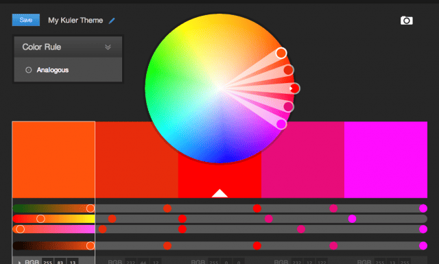
If you’re working with an uploaded photo, you can create a complimentary color scheme with Adobe Kuler. You can also search color swatches by concept, hex values, and more. The tool is available through its site, desktop (Adobe Air) app or (Mac OS X) Dashboard widget.
- The best free tool of all? Creativity! Well, at least monetarily free. Taking the time and effort to get creative is invaluable to any type of content generation. Brainstorm unique ways to illustrate your giving levels as they relate to your organization and its mission. Personalizing your visual storytelling in this way can make your organization stand out and drive donor engagement to whole new level.
Creating a visual for your giving levels is a great way to demonstrate the impact of your supporters’ contributions. Although paying for certain resources might be unavoidable at times, there’s a host of free and easy tools online for any non-designer to try their hand at visual content production. There are many ways to craft this graphic to fit your organization’s distinct mission and marketing budget, so the sky’s the limit for creativity!
Win the Hearts and Minds of Donors
Image Credit: Derrick Coetzee


