The Nonprofit’s Donation Page Checklist [GUIDE]

Your donation page is your organization’s most valuable tool. An underwhelming first impression or a poorly structured design can be the difference between converting a visitor or losing a donation.
That’s why we’ve created this step-by-step checklist to help pave the way to increased conversion rates, revenue, and donor satisfaction.
Download Your Donation Page Checklist
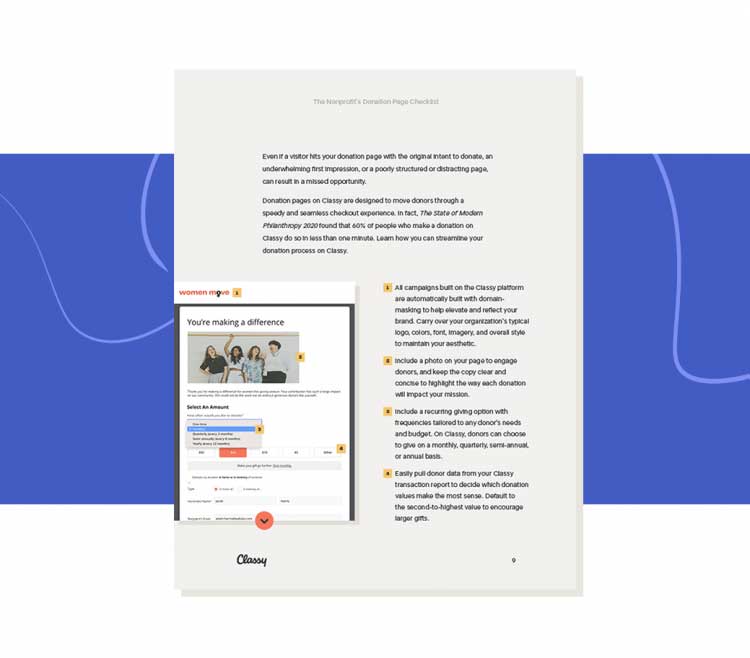
Use this checklist to cover off on must-have elements for your donation page, including things like:
- Brand colors and logos
- Giving options
- Domain-masking
- Suggested donation values
- Custom questions
- Dedications
Learn how to engage your audience with a branded look and feel, concise messaging, and a seamless checkout flow, and discover how Classy can help your organization reach its conversion goals.
Here’s a peek into what you’ll find inside:

Download The Nonprofit’s Donation Page Checklist today to optimize your page for conversion and raise more money for your mission.

The Nonprofit's Donation Page Checklist
Subscribe to the Classy Blog
Get the latest fundraising tips, trends, and ideas in your inbox.
Thank you for subscribing
You signed up for emails from Classy
Request a demo
Learn how top nonprofits use Classy to power their fundraising.


