10 Nonprofit Infographics That Inspire and Inform

Infographics have exploded in popularity over the last few years and they are great for social sharing. We’ve gathered some of the best examples from nonprofits to show you how to use graphics to inform and engage your community.
Click on any of the nonprofit infographics to get a closer look.
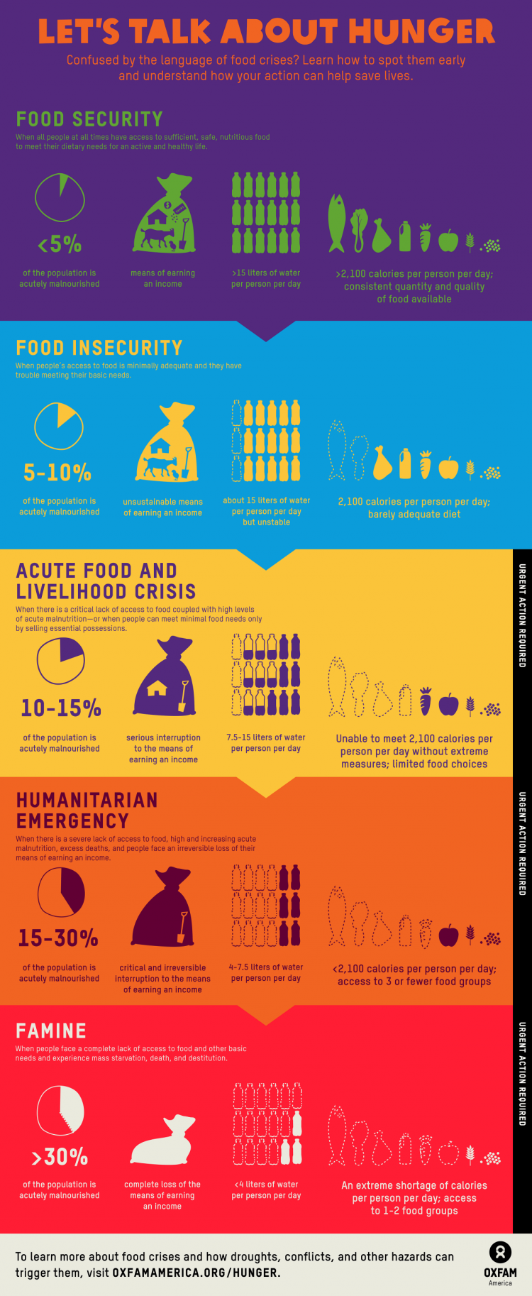
1. Oxfam America
Let’s Talk About Hunger
What We Love About It: The use of color to illustrate the increasing danger hunger poses in each situation. The gradual transition from purple and blue into red conveys the urgent need for aid.
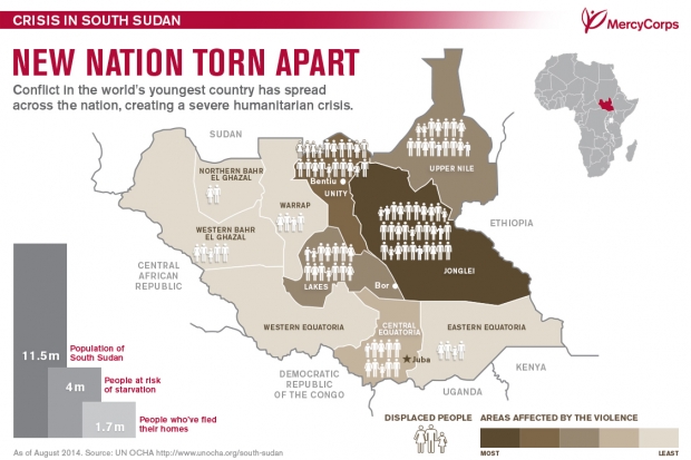
2. Mercy Corps
The Crisis in South Sudan
What We Love About It: The image uses bar graphs, geography, and shading to show a ton of information without becoming visually confusing.
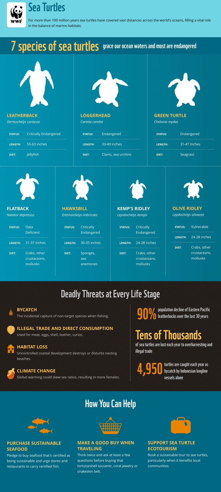
3. World Wildlife Fund
Everything You Ever Wanted to Know About Sea Turtles
What We Love About It: The three main sections tell a story to the reader by introducing the turtle species, explaining what is threatening them, and showing people how they can help.
Read Next: How to Turn Bad News into Hope by the W.W.F.4. World Food Program
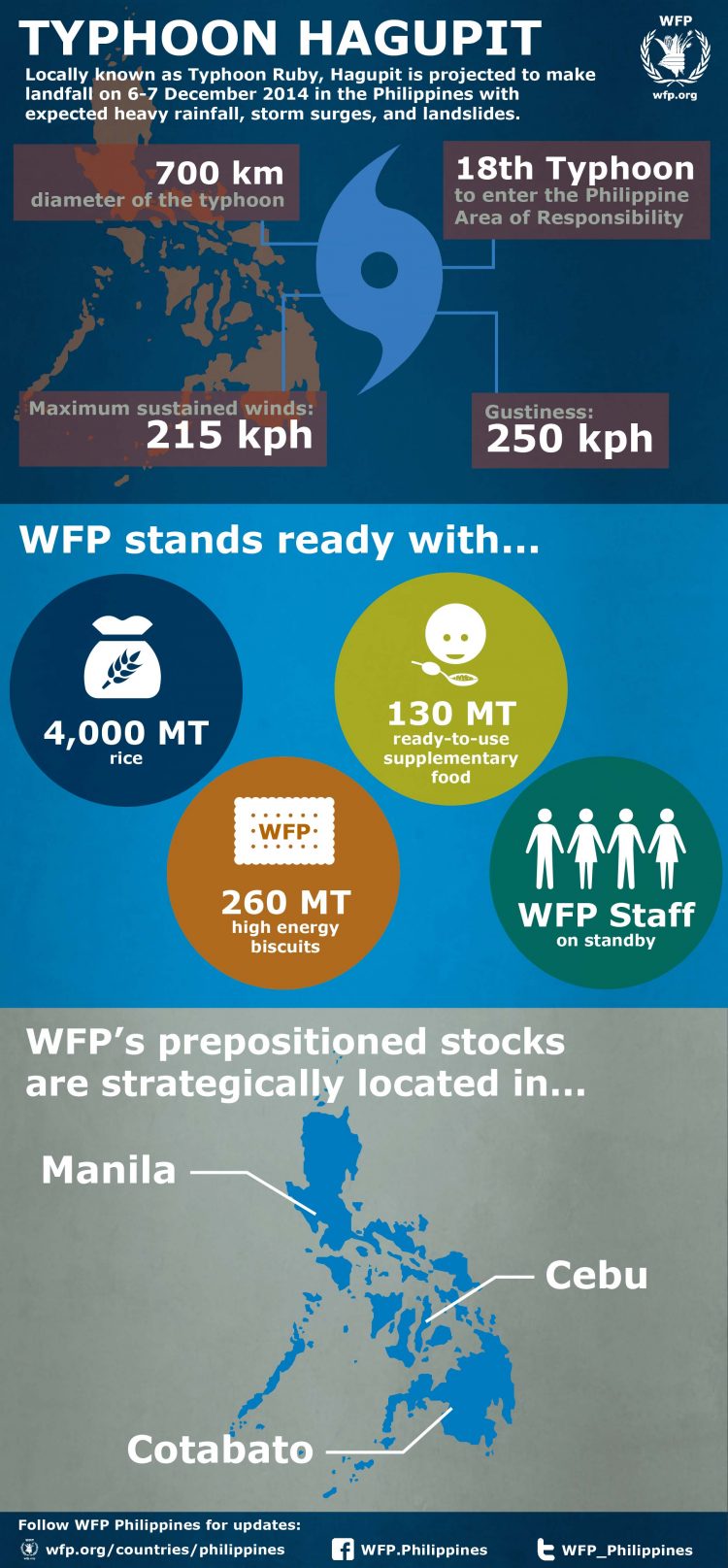
Typhoon Hagupit in the Philippines
What We Love About It: The map and storm details show how the World Food Program is prepared to face Typhoon Hagupit. The middle section with the supply and staff icons is also an eye-catching way of relating their plans.
5. buildOn
The Global Education Crisis
What We Love About It: buildOn is a nonprofit that funds and constructs schools in developing countries along with offering afterschool programs in the United States. To highlight their mission, they use school supplies like rulers and notebook paper to break up the infographic into digestible chunks.
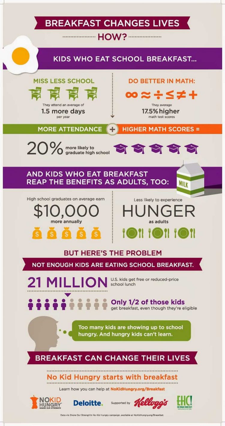
6. No Kid Hungry
Breakfast Changes Lives
What We Love About It: No Kid Hungry makes great use of bigger text to highlight the most impactful statistics. The simple imagery allows readers to focus on the facts.
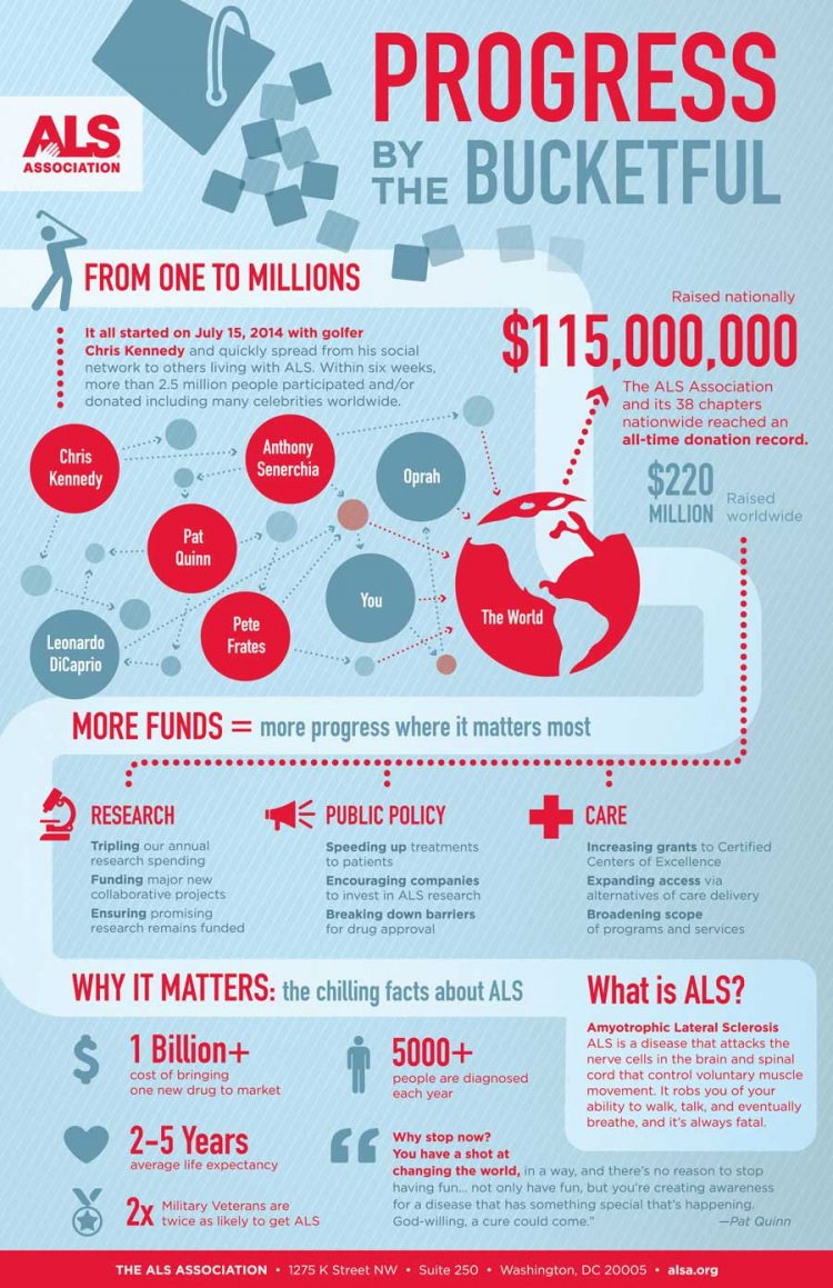
7. ALS Association
Progress by the Bucketful
What We Love About It: The ALS Association used an infographic to recap and explain the impact of their viral Ice Bucket Challenge. They show how a sharable graphic can help distribute information following a fundraising event.
Child Labor in Tobacco Farming
What We Love About It: While many infographics benefit from bright colors, the subdued hues in this image match and highlight the subject matter.
9. Habitat for Humanity
30 Years With the Carters
What We Love About It: While not every donor or volunteer will have as big an impact as Jimmy and Rosalynn Carter, this is a wonderfully creative way of saying “thank you.”
10. Amnesty International
Prisoners in Isolation
What We Love About It: The dark imagery in this infographic illustrates the experience of the prisoners in question. The use of yellow on black is striking while maintaining a sense of deprivation.
Thanks for checking out these awesome examples of nonprofit infographics. Incorporating images like these into your blog, on social media, and in other communications can help you spread the word and engage with your audience.
Did we miss your organization’s killer infographic?
Share in the comments!
Read Next: A Nonprofit Storytelling Infographic How-To
Become a Social Media Expert
Subscribe to the Classy Blog
Get the latest fundraising tips, trends, and ideas in your inbox.
Thank you for subscribing
You signed up for emails from Classy
Request a demo
Learn how top nonprofits use Classy to power their fundraising.

