Why Your Nonprofit Website Can’t Just Be “Good Enough”

“If it ain’t broke, don’t fix it.”
This often seems like the best philosophy for nonprofits with limited resources and time. But when it comes to the constantly evolving facets of web design, “good enough” just isn’t good enough.
Many people are on the internet every single day, encountering new sites, the latest designs, and application updates. The world of web design is constantly moving and no organization can afford to stand still.
Younger generations especially have little patience for slow or poorly maintained websites. One survey found that millennials’ top pet peeves on nonprofit websites are interfaces that are not mobile-friendly, those with missing information, and the inability to find the information they want quickly and easily. This means potential donors, volunteers, and advocates are walking away when you could be luring them in.
The Window to the Soul
Too often, nonprofits think of their website as simply a box to check. They know they need one, but they see it more as their listing in the yellow pages than what it can be: a window to the soul of your organization.
Okay, maybe nonprofit organizations don’t have souls, but their website is one of the most important ways that the public interacts with them.
Your website…
- Explains your mission and programs to potential supporters
- Offers more information to your community about upcoming events and fundraising campaigns
- Solicits donations and recruits peer-to-peer fundraisers
- Refers people to your social media profiles and generates followers
- Portrays your organization as a change-maker in the space to journalists and corporate social responsibility programs
When you start thinking of your website as a potential generator of revenue, PR, and partnerships, the importance of keeping your site updated and user-friendly becomes apparent. If you have a mediocre website with mediocre content, you will get a mediocre response from visitors. But if you have a website that illuminates your cause, conveys your impact, and touches visitors, you will have a powerful recruiting and fundraising tool available 24 hours a day.
Design for Your Audience
In both websites and other forms of design, there is a growing emphasis on the user experience. Simply put, you should always be evaluating your site from your audience’s point of view. For social impact organizations, that includes donors, funders, fundraisers, casual supporters, people interested in the cause, and media outlets.
To help identify where your site is lacking, consider the following user experiences and how you can optimize them.
- Donor/Fundraiser – How easy is it to make a gift or create a donation page? How many webpages must they navigate through to complete a form? Can they reach a donation or campaign creation page from your homepage? How long is the form?
- Funders and Others Interested in the Cause – Can you tell from the homepage what your organization does? Do you have an “about” page that gives your history and core values? Do you have more in-depth information on your programs on their respective webpages? How do you show your impact? Can you access annual reports from your website?
- Media Outlets – Does your website offer up-to-date contact information? Do you list your leadership team and PR contact? Do you add news about your programs and cause?
Design for Engagement
Like a successful social impact organization, a successful website doesn’t just get people to look at it, it gets people involved. With the right features, your organization’s website can be a portal through which people learn about, engage with, and support your cause.
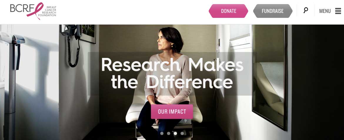
The most obvious way to get people to take action is to make the option to donate readily available. Nearly every page on your site should have a donate button. It doesn’t have to be the focus of the page, but devoting a little space to this button means that whenever a donor feels moved to help, they can act immediately.

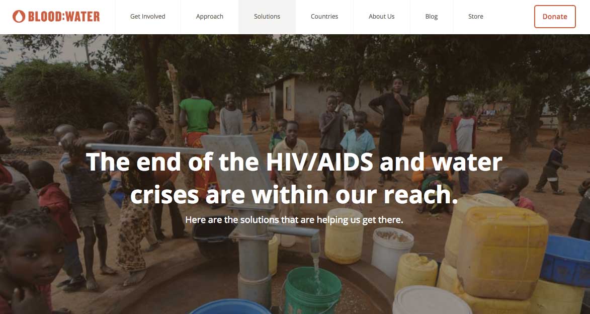
Blood: Water’s “donate” button is in the top right corner, whether you are on their homepage, solutions page, or “about us” page.
You can do the same with a button to start a peer-to-peer fundraising campaign.

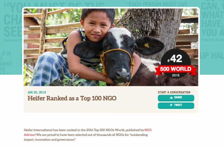
Another important part of making your website engaging is to add social sharing links and invite people to follow and share your content. On this page announcing their selection as a top nonprofit, Heifer International lets donors know they can share the post to their Twitter or Facebook accounts.

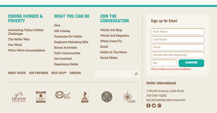
Visitors who scroll to the end of the page learn that they can get cool updates like these in their inbox by subscribing to Heifer’s email list.

Your website can also present visitors with the option to register for events, participate in polls, or use interactive tools. The goal is to get potential supporters engaging with and participating in your work. Creating these opportunities on your website is one of the most important pillars of nonprofit web design.
Design to Do Good
Although redesigning or revamping your nonprofit’s website can be a daunting task, if you approach it with clear objectives and priorities, it can also be extremely rewarding. In many cases, your website is your first chance to really introduce yourself and explain your mission. If you can do that effectively and create clear pathways for action, your organization will attract more supporters and revenue online.

The Nonprofit Growth Guide


