7 Quick Ways to Optimize Your Classy Campaign for Mobile Fundraising

Not only is donor trust partially dependent on how easy it is to donate via their mobile device, but 28 percent of U.S. adults are fully smart-phone dependent with no other form of internet access. This means optimizing your Classy campaign for mobile fundraising is a must.
People are busy between family gatherings, school activities, afternoon meetings, and more. We know that 84% of American donors will enter the 2021 year-end giving season with the intention to give the same amount or more than they did in 2020, but limiting these on-the-go supporters with unresponsive donation pages and antiquated payment options could mean losing out on impactful contributions.
A mobile-friendly campaign is imperative to effectively reaching your donors anywhere, from any device. Read on to discover seven simple ways to elevate your Classy campaign to increase mobile fundraising revenue and improve your overall donor experience.
7 Ways to Make Your Campaign More Mobile-Friendly
1. Think About How Images Show Up on Your Landing Page
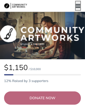
Your hero block is the first thing a donor sees when they land on your Classy campaign. To ensure your design stands out, start by deciding how you want your headline to appear. We recommend using a headline image on your landing page instead of a simple text headline to add visual appeal and give you more control over how your page looks.
Headline images are automatically optimized for mobile so they will readjust to fit any device without skewing the image. This is not the case for a standard text headline. These headlines often get cut off when viewed on a mobile screen.
To offer the best viewing experience for your donors, create a custom headline image using Google Slides or another creation tool that both reflects your brand and communicates your campaign narrative.

2. Use the Right Amount of Impact Blocks to Drive Action
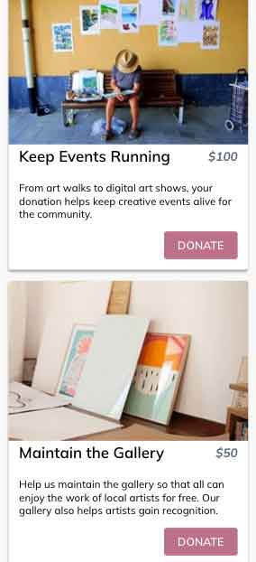
Showing the impact of each donation is critical to conversion. Keeping in mind that most donors will be visiting your page from a cell phone or tablet, be sure your impact blocks are optimized for any device.
The impact blocks on your Classy campaign landing page will appear vertically stacked when viewed on a mobile screen rather than aligned horizontally as they do on desktop. To avoid an endless scroll, limit your impact blocks to four or less.

Customize each block’s headline and supporting image to elevate the visual appeal and describe what each suggested donation amount can accomplish. Arrange your impact blocks from highest to lowest suggested gift sizes to encourage larger donations and be concise, yet specific with your text.
Remember, when a donor understands the impact of their gift, they’re more likely to come back to donate again.
3. Give Multiple Opportunities to Donate
One of the luxuries of Classy’s customizable landing pages is the ability to add as many calls to action (CTAs) as you’d like to help motivate donations.
Make it as easy as possible for donors to get involved with your campaign by incorporating multiple opportunities to make a gift.
Here are a few suggestions on where to incorporate a donation button on your homepage:
- Beside your progress bar. Incorporate one donate button above the fold, preferably beside your progress bar, to create a quick and easy way for donors to see the social proof of others supporting the cause. With this button at their fingertips, they can immediately take action.
- Within your impact blocks. A bit further down the page, your impact blocks present another seamless opportunity to ask for a donation. Suggest how different levels of donations can help support your nonprofit during these times and include a high-contrast donate button within each block to guide supporters directly to your donation page.
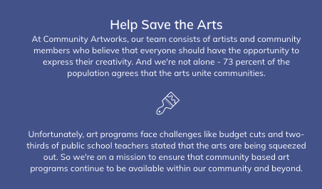
- In a custom text block. Get creative when designing your page by including custom text blocks. These blocks require zero coding knowledge and allow you to add a personal touch through copy, images, videos, and CTAs. Customize the headline, content, and background of your block to draw donors’ attention.
4. Keep Your Text Short and Sweet
The longer a supporter has to scroll to find what they’re looking for on your campaign page, the more likely they are to abandon the donation process before finalizing their gift.
It’s important to remember that the length of your landing page drastically increases when viewed on a mobile device. The copy, visuals, and CTA buttons reformat to the narrower screen.
When you’re writing content for any donor-facing pages, remember why social platforms have character limits. Today’s world wants quality information fast.
With this in mind, break up the text in your “About the Campaign” section into smaller chunks to avoid word walls. Tighten up your text throughout the rest of your page as well to prevent donor fatigue, and focus on descriptive, sensory words that paint a clear picture of the impact each gift will make on your beneficiaries.

5. Complete the Experience With Mobile Payment Options
Roughly 110 million Americans are familiar with using a digital wallet, and 80 million prefer digital wallets because it eliminates the need to carry cash and cards. Ensure your nonprofit is delivering an experience that matches donor expectations by enabling digital wallets on your Classy donation page.
Provide donors with an easier checkout experience that mimics any other transaction they’re used to making. This increased level of comfort and familiarity helps gain donors’ trust and improve retention. In fact, organizations on Classy see an 11-14% lift in mobile conversion rates when digital wallets are enabled.
Classy Pay, our seamless integration with Stripe, gives you the tools you need to create a frictionless, convenient, and secure donor experience that’s easy to manage. Flexible payment options, including credit card, ACH, digital wallets, and PayPal, boost conversion rates, improve donor retention, and provide secure, reliable payment processing.
Learn How to Create a Seamless Checkout Flow
6. Be Mindful of Your Donation Page Background Image
The background image of your Classy donation page often gets cut off on a mobile device. To avoid detracting from your donors’ experience, select an image that won’t lose its value when it gets reformatted.
If there’s a particular photo you would like to share and don’t want it to get disrupted on mobile, place it in the content section of a custom text block and use a basic background image instead.
7. Cap Your Number of Custom Questions
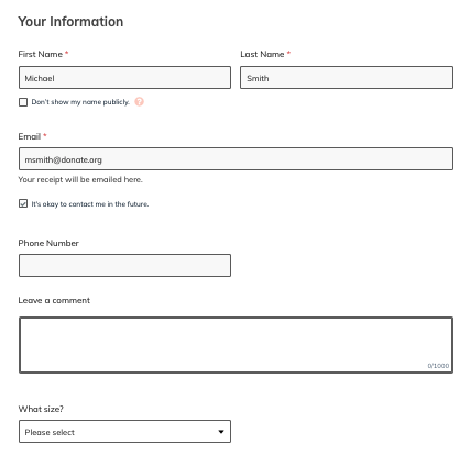
Be aware of the number of fields you’re asking your donors to complete on your donation form. Fewer is generally better when it comes to custom questions.
Nonprofits typically use custom questions to gather additional information about their donors, like birthdays, phone numbers, or reasons for giving. These insights can help you better understand your donor base and tailor your outreach strategy accordingly.
Identify what information is the most important to know and what can be saved for a later date. While these fields can be extremely useful in gathering additional contact information or other pertinent insights, it’s more important to keep your donors on track to give.

Test Your Mobile Fundraising Donor Experience
Test your donation process from a donor’s perspective to ensure your page is optimized for conversion. Invite your team, board members, friends, and family to run through this quick checklist before pushing your page live to confirm it’s up to your nonprofit’s standards.
- Try the pages out on different devices and browsers to experience how your campaign will feel for all donors. Test the process on an iPhone and Android, and move through the donor experience on Safari, Chrome, and Firefox.
- Preview your campaign on multiple devices. Using Chrome, you can right click “Inspect” to see what your page will look like on different phone screens. Classy’s editor tools also allow you to preview the page on desktop and mobile.
- Run a stopwatch to see how long it takes you to complete a donation, and make changes as needed if you find it’s too demanding.
Take Your Mobile Fundraising to the Next Level
Meeting your supporters where they’re at is critical to donor acquisition, engagement, and retention. Get strategic with your mobile fundraising experience to ensure that your campaign narrative comes across in a compelling way, and your donors are provided with a seamless path to give.
Posted in Fundraising

Your Donation Page Checklist


