4 Pro Tips on How to Use Impact Blocks Creatively
When someone is deciding whether or not to donate to your nonprofit, showing them the impact their gift has on your beneficiaries, programs, and advancement of your mission is critical. Classy’s impact blocks were designed specifically to help you communicate this impact by showing where someone’s donation goes, who it benefits, and what it accomplishes. When a donor understands the impact of their gift, they’re more likely to come back and donate again.
Learn How to Optimize Your Fundraising Campaigns for Conversion With These Checklists
Demonstrating the impact of donations has never been more important than it is during the COVID-19 pandemic. Whether your nonprofit is directly mobilizing coronavirus relief or raising emergency funds to sustain normal operations, people need to see how their donations help provide resources and care or help keep the lights on at your organization.
However, it’s not enough to simply put impact blocks on your campaign page and hope people click on them. You must be specific, emotional, creative, and flexible with the copy you write, photos you use, concept you iterate, and location you place them.
Below, we’ve rounded up four creative pro tips you can use to make your impact blocks pop based on real-world examples we’ve seen from nonprofits during the COVID-19 pandemic.
To hear how you can elevate your cause in a post-pandemic world, access session recordings from the 2021 Collaborative for free this year.
Register for Free to Access 100+ Session Recordings from the Collaborative
1. Get Specific
In the wake of the COVID-19 outbreak, WaterAid created an emergency fundraising campaign separate from their Clean Water for Clinics campaign. This new page was branded as an Emergency Global Hygiene Fund dedicated specifically to improving handwashing and hygiene in the different countries where they operate.
The copy on the page is direct and to-the-point, and it creates a narrative that drives urgency to donate immediately. It clearly explains the need for the emergency fund with lines like:
- “Handwashing is the first line of defense against Coronavirus”
- “As the COVID-19 pandemic spreads, millions do not have access to soap and water for handwashing. Help us save lives.”
- “Communities and governments are asking for our help, urgently. To contain the spread of Coronavirus, we must deliver hygiene and handwashing programs around the world, right now.”
These potent calls to action culminate in their impact blocks section. Each impact block clearly explains how far donations will go to support the mission of this emergency fund:
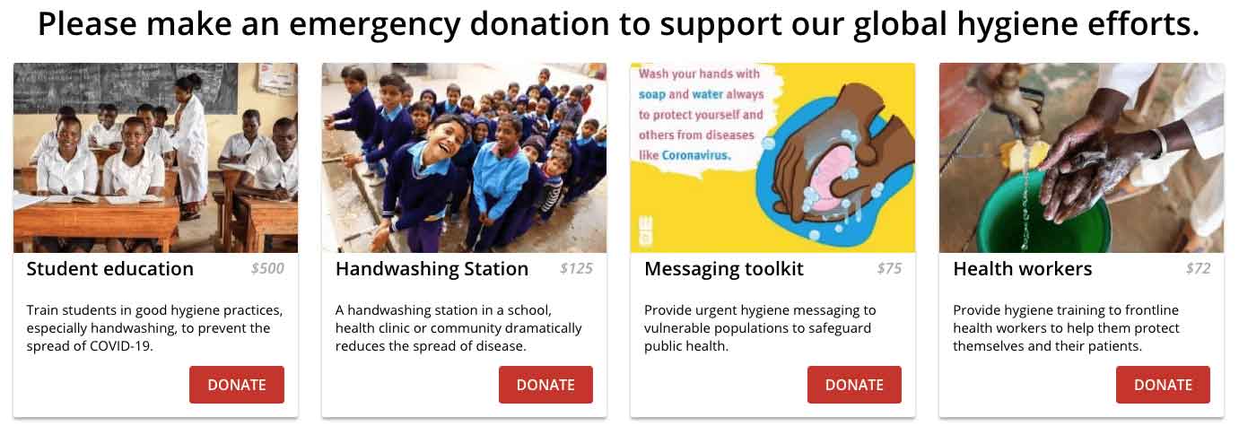
Specificity is important, especially if your nonprofit’s day to day operations cover a lot of different areas. For example, WaterAid is committed to hygiene programs, but they also supply water pumps, showers, sinks, solar panels, water pipes, drinking fountains, and taps in the communities they serve.
Getting specific with the ask in your impact blocks, like WaterAid does here, can go a long way toward uniting all donors behind a common front. In this case, the singular goal to support the emergency hygiene program is broken down further in each of the four blocks which detail, specifically, how a donation will help achieve this goal.
2. Get Emotional
Similar to WaterAid, CoreGiving began an emergency fundraising program to support students left without school lunches, and their families, during the COVID-19 pandemic. Schools have remained closed, children are at risk of missing a meal and some parents are left wondering how they will cover the cost.
This is an inherently emotional situation, and CoreGiving made plays to that emotion with their impact blocks section. They offer eight different donation options, each paired with photos of children that tug at the heartstrings:
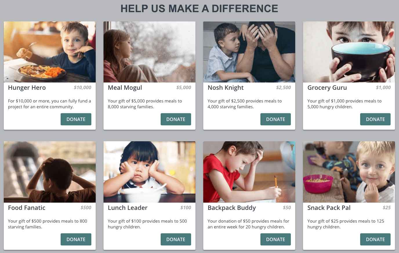
Paired with each photo is a creative title, often heroic in nature, that donors can rally behind as they make their donation. That is, while children might be hungry and families may be worried, a donor can feel confident in their own ability to be a leader, knight, guru, or mogul: they can feel confident in their ability to help remedy the situation.
Beyond that, each impact block has a clearly written description of precisely how many meals this donation will cover for students. Also, notice how they start with the highest donation on the left, and decrease as you move further down the blocks. This can help encourage people to donate higher amounts as they respond to the emotional appeal you’re putting in front of them.
3. Get Creative
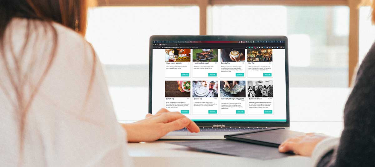
Bartenders, baristas, servers, and countless others in the hospitality industry took a major hit with regard to job loss during the COVID-19 outbreak. Another Round Another Rally decided that they would help out with a fund that supported these hardworking individuals during a period of unemployment or severely reduced hours. So, they took a traditional crowdfunding campaign page and, with creative use of the impact blocks section, turned it into a virtual tip jar.
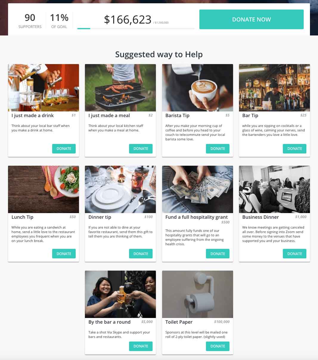
First, they moved the impact blocks section directly underneath the hero image block on the page. Second, they designed each impact block with a special call to action that’s anchor to something unique about the hospitality industry. For example, the $25 “tip” has a call to action to think about the bartenders in your area:
“While you are sipping on cocktails or a glass of wine, calming your nerves, send the bartenders you love a little love.”
Placing your impact blocks at the top of the page also unites the section with your progress bar, which can be key for driving engagement from supporters. Some enjoy coming back to the page over and over to see how far your nonprofit is to completing its goal. They may even donate again if they can see you’re making progress.
4. Get Strategic
Aside from the photos you use, copy you write, and donation amounts you include, you can also physically move the location of the impact blocks on your campaign page. In the examples above, this is a tactic that both CoreGiving and Another Round Another Rally use to place the impact blocks immediately below the hero image.
To accomplish this in Classy, it’s as simple as dragging the impact section in the campaign builder:
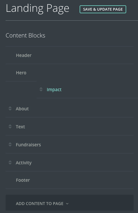
This can be used to ensure your impact blocks seamlessly fit with the flow of your campaign page’s narrative, whether they’re strikingly bold at the top or closer to the bottom as a heavy-hitting call to action. Don’t be afraid to get creative and play around with the layout of your impact blocks.
There’s more than one way to make use of the impact blocks on your campaign page. Regardless of what you choose to use them for though, they’re still united by the common thread of demonstrating impact.
If you’d like to learn more fundraising best practices, or see creative campaign examples like this, you can access all the recordings from the live sessions at the Collaborative: Virtual Sessions, as well as over 20 bonus Extended Sessions, for free below. They’ll provide actionable tips for growing your organization, adapting to changing circumstances, leading through times of crisis, and so much more.
Posted in Classy Crowdfunding Fundraising Peer-to-Peer Product

Checklists for Crowdfunding, Peer-to-Peer, and Event Fundraising Campaigns

