How to Simplify the Donation Process: Give Donors a Direct Flight

Some people like flying and some people absolutely hate it, but whether you’re a nervous flyer or a veteran jetsetter, you probably prefer a direct flight. It’s just easier to deal with one boarding pass, one flight, and one destination. A direct flight makes the entire travelling process easier, which is why many people are willing to pay extra for it.
The same concept applies to customer service as a whole, and even donor stewardship. The easier you make the buying/donating process, the more likely the user is to convert. For airlines, it might take the form of offering early check-in or expediting the boarding process. Nonprofits can also offer donors a direct flight by making the giving process as simple and streamlined as possible.
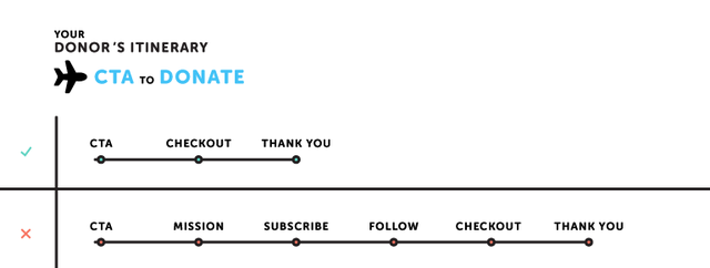
If you were the donor, which flight would you prefer?
It Starts with the Call to Action
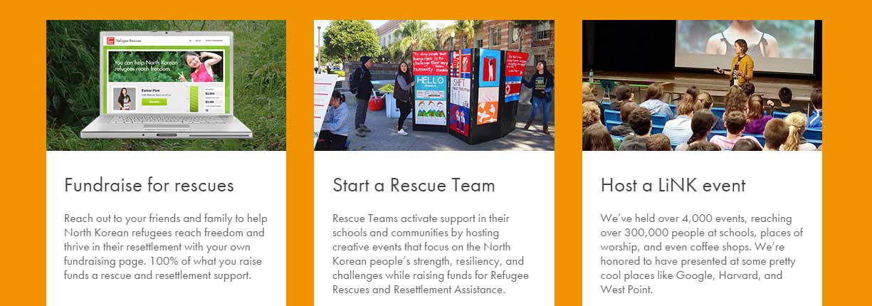
The first step to making the donation process quick and easy is to offer eye-catching, direct CTAs. It allows donors to express their intent to give with the click of a button and it allows the organization to get right to the donation form.
Someone viewing your webpage should be able to click on a “Donate” or “Fundraise” button from any of your website’s pages. For many pages this can just be a brightly colored button in the top corner, but on other pages, you can make the CTAs much bigger.

Size and color are great tools to grab a donor’s attention, but you can also adjust the text for the most effective CTA. “Donate” and “Fundraise” are great options that work for most organizations. Some nonprofits speak directly to impact with their CTAs.

To find what works best for your organization, consider performing some A/B tests to see what color, size, and text get the most clicks.
However you style your CTA, if people click on it, that’s your cue that they are looking for the donation page and you should get them there.
Pronto!
A Smooth Landing Page
After someone clicks on the “Donate” button, how many more pages do they have to go through?
The answer should be one and only one.
Your “Donate” CTA should take the user directly to a streamlined donation website. Keep the form short by cutting out unnecessary fields. You might ask one or two quick questions to learn more about the donor, but remember, every extra step is another chance for the donor to get distracted or second-guess their decision. It’s not about making people act without thinking, it’s about making it easy to do the right thing.
To help reduce distraction, you should limit the navigation options on your donation page. Getting rid of the navigation bar can help your supporters stay on this page and complete the process. Make it easy and intuitive for the donor to finish the form and hit the submit button.
Reaching Your Destination
The final step in your donation process is an important factor in creating a simple and satisfying experience. To return to the flying analogy, the experience is not over when the plane touches down. Passengers want to be able to quickly leave the plane and receive their checked luggage. If that doesn’t happen, even a good flight can become a horror story.
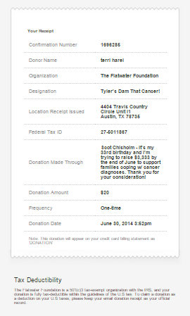
When a donor completes your form and submits their gift, two things should happen. First, they should arrive at a confirmation page to show that the submission was successful. Be sure to include a thank you message on this page. The second action that should follow a submission is a thank you email with a tax receipt.

These final touches leave the donor confident that their donation has been accepted. It neatly wraps up their donation journey. At the bottom of your confirmation page or email, you can link to some compelling impact stories or your blog. This is an opportunity to give the donor more information about the organization and helps them to immediately associate their gift with the impact it can have on the cause.
Optimizing your donation process is a simple way to improve the donor experience and make supporting your cause an easy choice. No matter how good your cause or how compelling your appeals, if you make your supporters jump through hoops to donate, some people won’t follow through. A streamlined donation process is a smart choice for your nonprofit and its community.
Read Next: 5 Ways to Optimize Your CTAs for More Conversions


