4 Tips for Effective Donation Buttons by Campaign Type
An effective donation button on your nonprofit’s website and individual campaign pages is the key to unlocking your fundraising goals.
After all, your donation button is your nonprofit’s main call to action (CTA). Standard guidance on showcasing your donation button for online giving includes ensuring it is easy to find, links to the correct page, and stands out using contrasting colors—but it doesn’t end there.
Today, we’re showing you how further to strategize its usage across your different online fundraising efforts. An intentional approach helps your story reach more ideal supporters and makes visitors more likely to take action as they digest and engage with your page.
Below, we look at creative ways to format the best donation button across different fundraising campaign types, with examples from five nonprofits that bring the donor experience to the next level.
1. Peer-to-Peer Campaigns: Focus on Strategic Placement and Visual Distinction
Peer-to-peer fundraising tools allow supporters to fundraise on your behalf. A donation button on your peer-to-peer campaign helps you collect even more one-time (and recurring) gifts for your campaign.
Since these two CTA buttons—to fundraise or donate—live on your campaign page, you want to distinguish them visually. That could mean using color variations, separating sizing, or adding a contrasting visual that guides a page visitor to the options you offer.
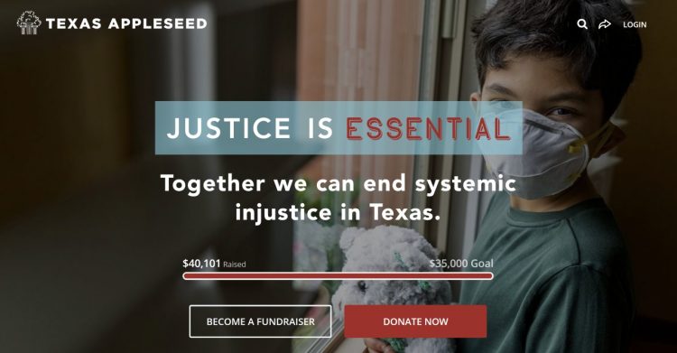
One example comes from Texas Appleseed, a nonprofit working to “promote social and economic justice for all Texans by leveraging the skills and resources of volunteer lawyers and other professionals to identify practical solutions to difficult systemic problems.” The nonprofit’s peer-to-peer fundraising campaign helped it raise over $35,000.
At the top of its campaign page, Texas Appleseed highlights the opportunity to fundraise and donate. The “Become a Fundraiser” CTA leads the two with a transparent background and white outline that grabs visitors’ attention.
Next to it is the highly visible donation button in red. Each CTA’s visually distinct yet grabby design catches the eye. The strategic proximity of these two buttons—visible at the top of the fold when a supporter lands on the page—gives supporters multiple opportunities to help the nonprofit reach its goal.
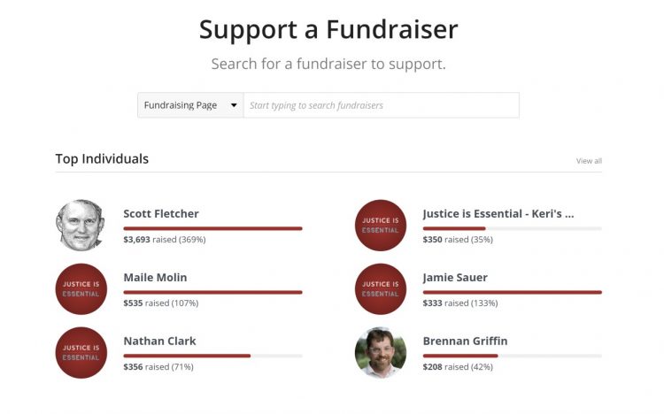
Farther down the campaign page, the nonprofit elevates the peer-to-peer component by listing some of the campaign’s top fundraisers and including the headline “Support a Fundraiser” to encourage donors to give directly to a peer’s personal fundraising page.
Pro Tip: By placing a donation button strategically alongside your CTA to fundraise, you can engage more donors by offering options for how they can participate in your peer-to-peer campaigns.
Crowdfunding campaigns allow for maximum creativity with your donation button. Below are two nonprofit examples that varied donation button options across Classy crowdfunding campaigns.
Incorporate Multiple Types of Donation Opportunities
Classy customer TWLOHA started a year-end crowdfunding campaign to share moments of hope and connect thousands of people to the help they need through mental health care access. The crowdfunding page featured a clear goal to raise $300,000 by the end of 2022, and three different donation opportunities to support the overall goal. The creativity helped the organization raise 122% of its goal and reach over 600 supporters who made it happen.
First, the campaign page displays an appealing visual with a bold statement, “Worthy of Tomorrow” that reflects the healing language that TWLOHA is known for. A Donate Now button is shown in a deep purple that visually contrasts the campaign progress bar it sits next to, helping anyone who visits see their direct impact on something much greater. The placement creates a quick, easy way for donors to see social proof that others have supported the cause, and direction on how to take action right away.

Farther down the page, the campaign uses impact blocks to suggest how different levels of donations can help support the nonprofit. TWLOHA even creates an incentive for contributing certain dollar amounts in the form of their creative and mental health advocating merchandise. Each block showcases a visual of the gift a donor can receive for supporting the campaign and a detailed summary of what that dollar amount can do for the beneficiaries of the organization.

As donors make their way through some compelling stats that showcase how the movement has already helped over 7 million people from high school students to individuals in crisis, the campaign page features one last opportunity to make a difference. Donors can see an opportunity to donate crypto and stock donations with a nod to the tax benefits of doing so and a clear donation button to help make it easy.

Pro Tip: By offering multiple donation buttons that cover various styles, giving preferences, and motivations throughout your crowdfunding campaign, you give your supporters the empowerment of choice about how they can help you meet your goal. Your donation buttons progressively tell your campaign’s story as the supporter scrolls through your page, with a surprising delight at every interaction.
Leverage Impact Blocks to Showcase Recommended Donations
Second Harvest of Silicon Valley provides healthy meals to anyone who needs one within its community. When the pandemic put a pause on its collection of in-kind food donations, the nonprofit started a crowdfunding campaign to fill the gap in its operations and keep the momentum flowing online.
The initial donation button for Second Harvest of Silicon Valley’s campaign is easy to find on the campaign landing page in bright orange, placed next to a short video showcasing some of the nonprofit’s beneficiaries.
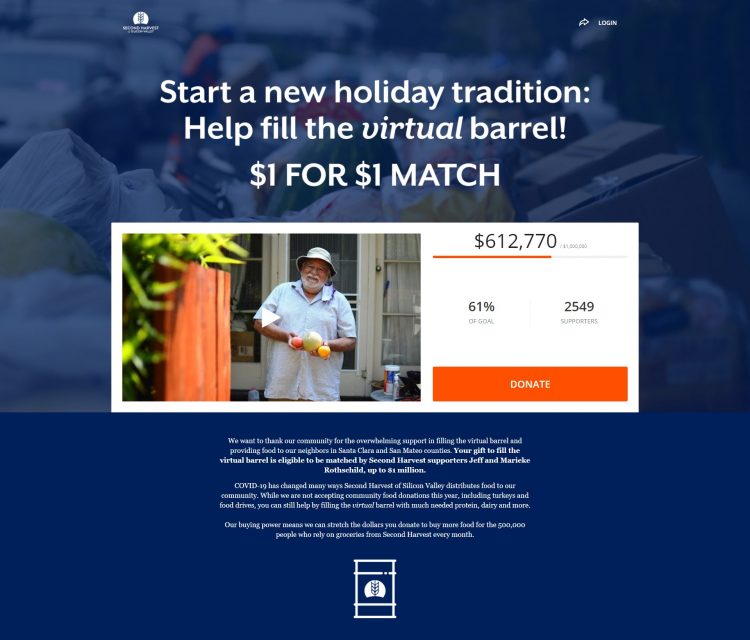
Next on the page is an overview of the nonprofit’s story, which highlights how its food distribution process looks different this year. Second Harvest of Silicon Valley explains how supporters can give a monetary donation for a particular item instead of in-kind food drop-offs.
Impact blocks show donors how different gift amounts translate to specific food items typically provided in kind. For example, the $50 impact block has a graphic of a roast chicken and says you can “fill the barrel” with 85 pounds of a whole chicken.
The visually engaging custom illustrations, complete with donation buttons in orange, are specific to its branding. You can get creative with visuals that speak to your audience and draw attention with Canva or other design platforms.
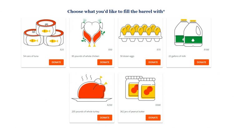
Pro Tip: By adding creative impact blocks with donation buttons on your crowdfunding campaign, you provide a fun way for supporters to understand the tangible impact of their donations. If you hit a creative rut, explore these eight simple designs you can create for free using Canva for Nonprofits.
3. Fundraising Event: Pair One-Time Donation With Registration
In registration with fundraising, you want your supporters to register for your event and start fundraising. For example, for ticketed events, your primary CTA is to buy a ticket.
Special Olympics Washington created a registration with a fundraising campaign page on Classy for its Polar Plunge challenge. On the campaign landing page, donors see a Register button alongside the donation button in the center of the hero block, under the event logo.
Farther down the page, the nonprofit again pairs a registration button with a donation button next to a progress circle, inspiring people to join those who have already contributed and taken action.

Pro Tip: By distinguishing your registration and donation buttons visually, you inspire participants to donate more at that moment and people who can’t make your event but still want to support.
Neighborhood Homework House started a recurring giving campaign to fund its mission to support students in its community. Its initial donation button pairs with text branded around the nonprofit organization’s recurring donations campaign. It explains, “For as little as $10 a month, you can rewrite the future of a generation of Azusa students.”
Below the initial donation button is additional text describing the power of small donations and that you can start supporting now by giving up small monthly expenses.
The campaign then incorporates impact blocks that showcase examples of things a supporter could skip each month to donate to the nonprofit instead. For example, a supporter could choose to donate their $40 tank of gas or $20 meal delivery.
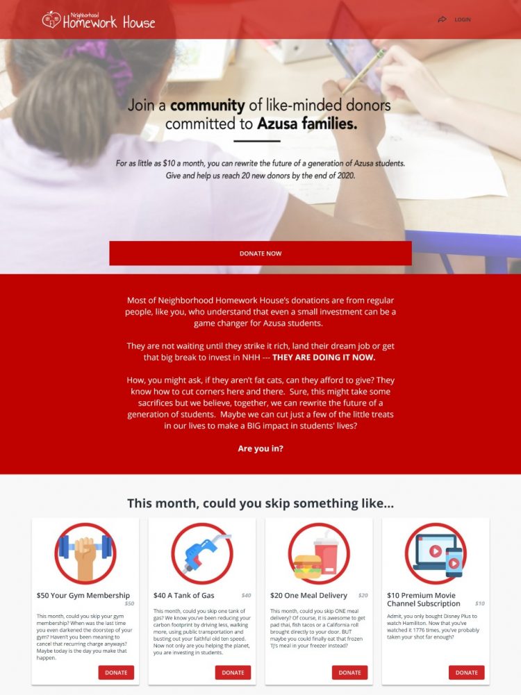
Pro Tip: By shaping your donation options around your recurring giving story, you build a case for your supporters to join your campaign.
Download Now: 8 Email Templates to Upgrade Recurring Donors
6 Bonus Tips to Round Out Your Donation Process
As you set up a donation platform that converts supporters into loyal donors, here are a few last items to check off your list to complete the experience.
- Offer suggested donation amounts to guide people and collect donations that make a real impact based on the programs you run
- Think about offering as many payment options as possible outside of just credit cards, such as trusted transaction apps like PayPal and Venmo
- Leave a checkbox that lets donors opt in to cover their processing fees and give the maximum gift to your mission
- Provide an easy way for donors to share their actions for good on social media to build cause awareness through their Facebook page or other accounts
- Consider embedding your donation form directly on your webpage with a simple modal, widget, or pop-up
- Test the whole process as if you are a potential donor through different mobile devices and browsers to make it as smooth as possible
Strategic use and formatting of online donation buttons can increase support across different campaign types. Think creatively about what types of donate buttons to use, how to place them, and ways to brand them to your mission to engage your audience and encourage donations.
As you build your donor-centric fundraising strategy, Classy has your back.
Build Your Campaign on Classy


