6 Unique Examples of Nonprofit Visual Storytelling

Visual cues help people understand and relate to what they see. In fact, the human brain can process images in as little as 13 milliseconds.¹
In your fundraising and marketing communications, visuals are crucial for helping cement an idea or a narrative into the mind of your audience. Statistics alone may make for a convincing argument, but visual narratives establish emotional connections that incite people to take action.
Below, we’ll discuss more on why storytelling is critical for nonprofits. We’ll also highlight six visual storytelling techniques your nonprofit can employ to improve its fundraising metrics—including an example of each strategy in action from real nonprofits.
Why Is Storytelling Important for Nonprofits?
According to the Visual Teaching Alliance, 90% of information transmitted to the brain is visual, with images processed 60,000 times faster than text.² Given the ease with which people absorb visual media, nonprofits can benefit from the power of visual storytelling greatly.
You can use visual storytelling to turn your messages—even those that might seem nonvisual in nature, like numerical data—into narratives that engage and compel supporters to act. When forming your nonprofit’s content marketing strategy, remember that storytelling is the catalyst to conversions and strong donor retention.
Using a comprehensive product suite like Classy helps keep storytelling at the forefront of your digital marketing. You can embed imagery into your donation websites, email marketing, and virtual fundraising events easily to help drive donations and foster lasting relationships with your supporters.
6 Tips for Impactful Visual Storytelling (With Examples)
To inspire your visual storytelling, we’ve rounded up six examples of visual storytelling from real-world nonprofits. Each demonstrates a powerful way to use storytelling techniques to forge connections with your audience.
1. Center Your Visual Stories Around Timely Events
Using real-time national events can capture your audience’s attention since people are likely tuned in to what’s happening. Philly PAWS, a nonprofit saving homeless and at-risk pets in the Philadelphia area, employs this storytelling strategy during Super Bowl Sunday.
The nonprofit shares photos and videos of its animals on Instagram and through tweets to tell their stories and encourage supporters to donate or adopt a pet in need. Using a timely event like the Super Bowl helps advance the visual messaging.
During Super Bowl season, Philly PAWS highlights perfect “game day buddies,” like a series of senior dogs currently at its shelter. This approach gives an adorable image to its brand story, helping donors envision tangible ways they can help while reaping some cute benefits.
2. Use Visuals to Connect Supporters to Actionable Insights
Every day, supporters scroll through their timelines on social media apps, only to be inundated with content. To make yours stand out, think of ways your visuals can provide relatable, useful, and applicable material on your subject matter. This will encourage followers to pause and connect with your mission.
To Write Love on Her Arms (TWLOHA) is a nonprofit movement dedicated to presenting hope and finding help for people struggling with depression, addiction, self-injury, and suicide. The nonprofit uses various visuals on its social media platforms to share information about these complex topics with its target audience.
TWLOHA’s posts show that you don’t need professional photography to create compelling graphics. In an Instagram post about alcohol awareness, it uses a colorful background with simple text to create a series of slides that educate supporters on the effects of alcohol. The quick visuals leave followers with actionable takeaways for pursuing a sober life or creating safe sober spaces for friends.
In another example, TWLOHA highlights the power of self-care practices with a series of images showing where on your calendar you can fit in time for yourself. This helps tell the story of the nonprofit’s Show Up For Yourself campaign.
3. Elevate a Beneficiary’s Story on Your Campaign Page
An effective way to tell your nonprofit’s story is through the eyes of someone who has benefited from your services. Doing so through videos or photo essays creates a visual narrative that prompts an emotional response from your audience.
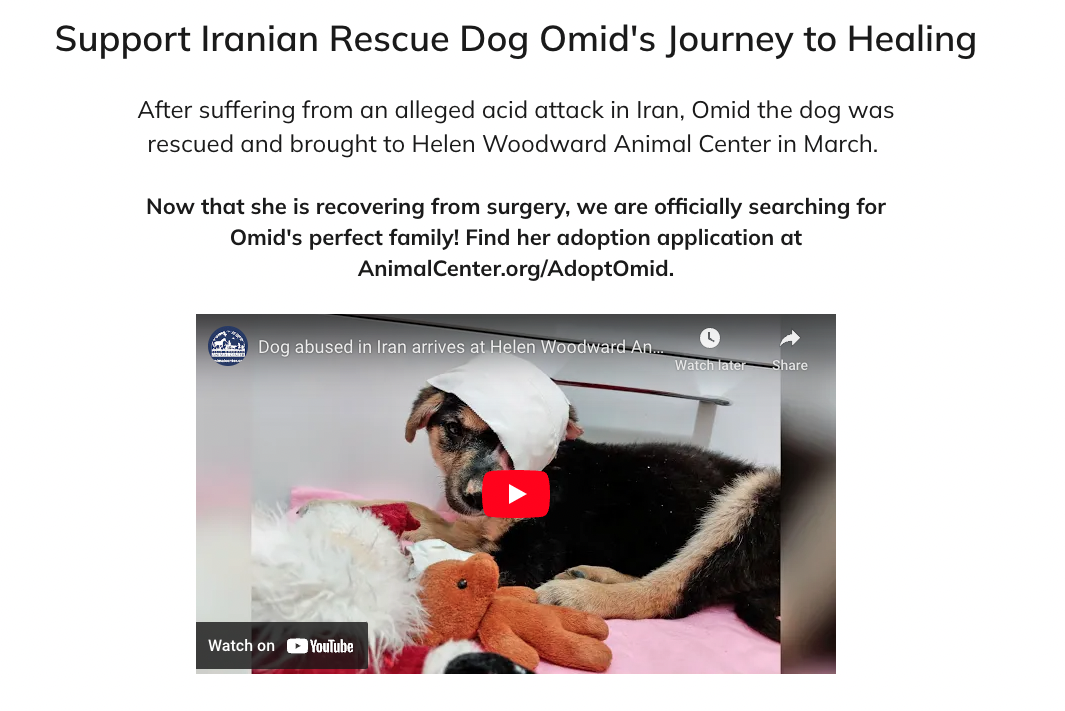
The Helen Woodward Animal Center is a San Diego nonprofit animal shelter committed to people helping animals and animals helping people. Through creative web design, it walks donors through visual stories of animals in need of support.
With the help of Classy, the nonprofit hosted its Hope for Omid campaign to design a compelling story about why and how supporters could help Omid, a rescue dog who suffered an alleged acid attack before being rescued and arriving at the shelter.
The campaign’s photos show Omid’s life before the nonprofit’s help and after he happily settled into life in San Diego. A video also tells the puppy’s story. By focusing on the story of one dog, the Helen Woodward Animal Center creates a visual of the overall impact of its work.

4. Personalize Your Campaign’s Impact Blocks
Your donation form is a step-by-step system for processing donor gifts. But it’s also an opportunity to continue to tell your nonprofit’s story using visual elements.
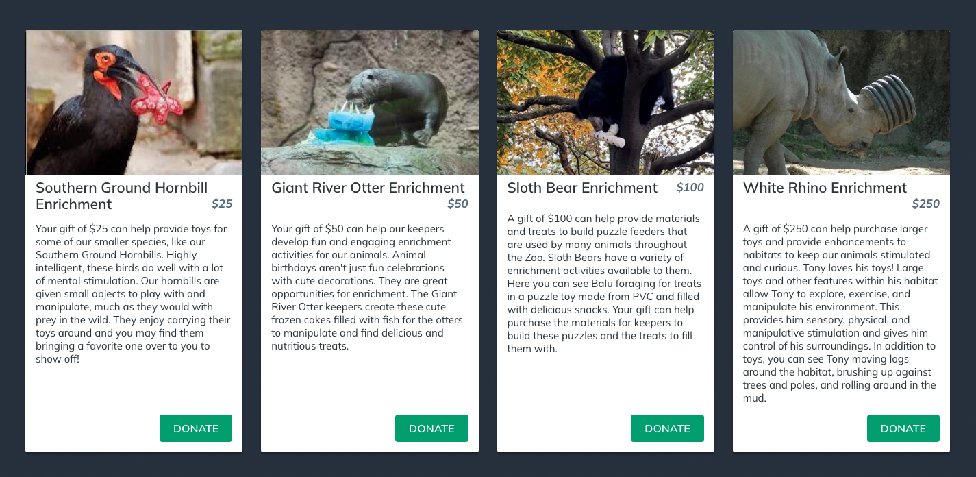
The Philadelphia Zoo incorporated a visual medium into its Zoo-a-Thon campaign to drive supporters toward suggested donation amounts. Using selected impact blocks for $25, $50, $100, and $250 donations, the nonprofit featured a photo of an animal at the zoo along with text on how that gift level would support that animal.
These creative impact blocks tell the zoo’s visual story while improving the user experience. It’s easy to click one of the levels and—with the help of pass-through parameters—complete a gift transaction quickly.

5. Be Creative Yet Cohesive With Your Visuals
There are many ways to tell your visual story. While photos and videos may be the first types of visual storytelling to come to mind, nonprofits can also leverage data visualizations, like graphs and infographics, or even memes and GIFs. As you add variety to your storytelling template, remember to keep your nonprofit branding cohesive throughout via color palettes, fonts, and tone.
Tap Cancer Out is a jiu-jitsu-based nonprofit raising awareness and funds for cancer-fighting organizations. On its Global Grappling Day campaign page, the nonprofit uses high-quality images, concise but descriptive content, videos, and infographics to stimulate supporter interest—all from donors and those looking to start a peer-to-peer fundraising campaign.
The various visual elements the nonprofit uses in its campaign holds its audience’s focus, not allowing for boredom or distraction. At the same time, the site’s color scheme, logos, and other branding elements provide a consolidated message that carries supporters through the full visual story.

6. Incorporate Headers and Footers Into Emails With a Call to Action
Email newsletters provide a great opportunity to embed visual content. An easy way to do this is to design eye-catching headers and footers that include your call to action. In between these, you can write a more in-depth message with additional information.
Concern Worldwide is an international humanitarian organization that strives for a world free from poverty, fear, and oppression. In its emails, the nonprofit uses personalized headers and footers to create a sense of urgency to give. By framing its message with these visual elements, it captures supporters’ attention to tell a story that supports its strong appeal.

Use Visual Storytelling to Connect With Your Audience
Whether through campaign pages, emails, social media platforms, or other communication methods, visual storytelling helps connect your supporters to your cause. With a strengthened relationship, you encourage lifelong giving as donors identify more easily with your message.
Make visual storytelling simpler by letting Classy’s personalization features help drive your message. You can incorporate multiple visual elements, from video to creative impact blocks, all while keeping your brand front and center.
Article Sources
1. “In the Blink of an Eye,” MIT News, last modified January 14, 2014, https://news.mit.edu/2014/in-the-blink-of-an-eye-0116.
2. “Visual Learning: 6 Reasons Why Visuals Are the Most Powerful Aspect of eLearning,” eLearning Industry, last modified December 8, 2017, https://elearningindustry.com/visual-learning-6-reasons-visuals-powerful-aspect-elearning.

Worksheet: How to Tell a Story


