What (And Why) You Need to Learn from These 5 Smart Year-End Fundraising Campaigns

Here at Classy, December is one of our busiest months. #Classyclients’ year-end campaigns are in full swing, and we’re lucky enough to witness some of the most engaging and smartly crafted campaigns out there run their course.
Want to learn by example? You’re in luck! Below, we chronicle the top 5 year-end fundraising campaigns. We’ve also provided takeaways from each one, so you can apply some of these strategies to your own fundraising campaigns in the New Year!
1. Push for Recurring Giving by Possible Health
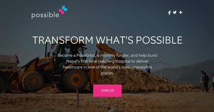
Possible Health is a nonprofit aims to universalize low-cost healthcare. Since 2008, the organization has treated more than 222,000 patients. Rather than asking for standalone year-end donations this December, the organization is encouraging supporters to get involved in a way that has longer-lasting impact: by joining its recurring giving program.
By becoming monthly funders, or “Possibilists,” donors can play an integral role in building Nepal’s first rural teaching hospital.

Possible’s campaign microsite is straightforward, easy to navigate, and beautiful. More importantly, it does an excellent job of conveying the importance of a recurring donation.
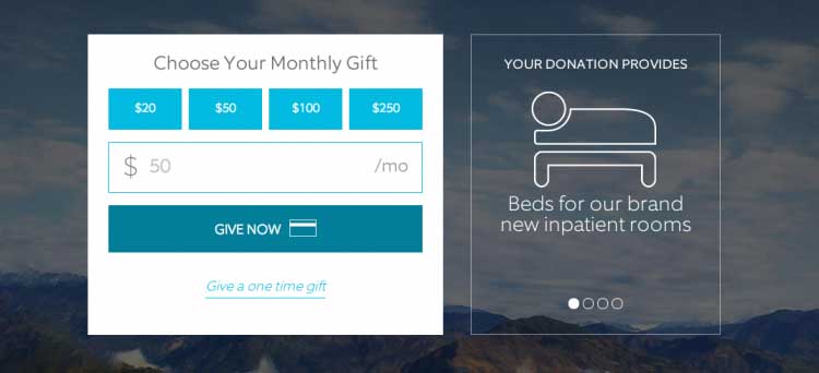
For instance, the graphics on their donation form make the connection between a monthly gift and its long-term impact.
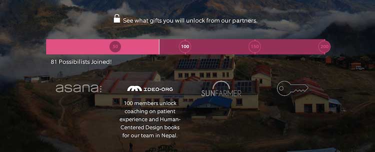
I especially love this visualization. This progress bar tracks the number of people who become monthly donors, leveraging social proof to attract supporters. As more Possibilists join, they can also “unlock” gifts from the organization’s partners. Displaying the progress towards these smaller targets motivates prospective donors to lend a hand.
The Takeaway: Visualize Impact – Use eye-catching graphics to demonstrate donors’ impact, especially when it comes to your recurring giving program. Because supporters might not be able to connect a monthly donation to its long-term impact, visuals help make a tangible connection between the act of giving and the change it makes possible.
Whether you display progress bars, interactive maps, or graphics to demonstrate giving impact, make sure you use visual content to create a connection between the site visitor and the importance of donating to your cause.
2. “A Creative Narrative That’s Impossible to Ignore” by Pencils of Promise

Pencils of Promise is an organization that trains and empowers communities through school builds, teacher training, scholarships, and water and health programs. The organization created an incredible microsite for its year-end campaign, Season of Promise. From the moment you hit the page, you’re pulled into a storyline that unravels the importance of taking action this season.
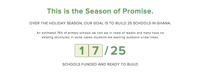
The beauty of the site lies in the narrative it creates. Not only does it immediately display the progress being made towards its goal, but it also guides the site visitor through the problem their solving, the solution they offer and how to get involved immediately.
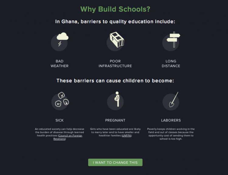

The Takeaway: Use your campaign microsite in a clever way. You might be surprised to find how impactful your site’s design can be on your campaign. Make sure to include how why the campaign is important, what specific problem it is tackling, what your solution is to the problem, what the outcome will be if you reach your goal and why it is important for your site visitors to act now.
Read Next: What You Need to Build a Great Nonprofit Website3. “The Stellar Holiday Fundraising Catalog” by Many Hopes
Founded in 2007, Many Hopes is an organization dedicated to driving sustainable community development in Kenya. They work to end the country’s poverty and corruption by building homes and schools for children; the organization also creates local business to sustain these initiatives long-term.
To benefit the girls in their homes, they’ve launched a holiday catalog of “impact gifts” that supporters can buy in honor of a loved one.
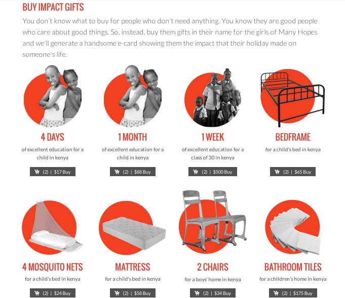
What I love about this campaign is that it really feels like I’m shopping a catalog. Like most fundraising catalogs, each gift is labeled with a price. But Many Hopes takes it a couple steps further.
For one, each gift displays giving levels based on how many you want to purchase. One bedframe, for example, costs $65. On the donation checkout page, the giving levels vary depending on how many you’d like to put in your cart (so to speak). This makes the connection between gift amount and impact super tangible to donors.

Additionally, each item comes with its own customized and branded eCard, so honorees know exactly what gift was made on their behalf. The option to send a Classy eCard featuring this bed frame makes the giving experience much more personalized and meaningful for both the sender and recipient.
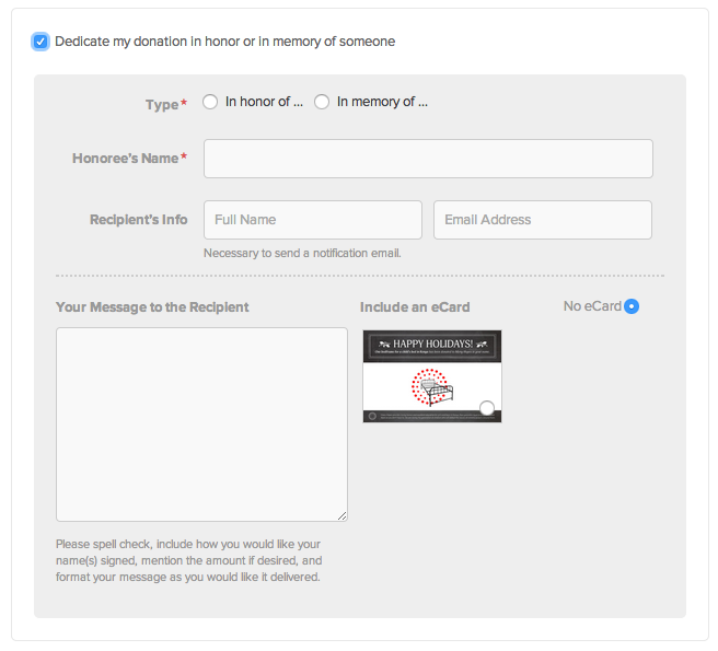
The Takeaway: Use eCards – Use eCards to make a donor’s giving experience extra special. And eCards aren’t just for the holiday season, either; you can design eCards for any occasion or fundraising campaign, any time of the year.
4. “Empowering Fundraisers to Raise More Money” by Choice Humanitarian

Choice Humanitarian is a non-governmental agency working to end extreme poverty through a holistic, village-centered approach. By connecting village leaders around the world to the right resources and tools, the organization helps communities create their own path out of poverty. Their work is addressing a serious issue, but this December, their #Rally2EndPoverty campaign offers everyone the chance to help advance its mission by having fun.
Launched on #GivingTuesday, the month-long campaign activates fundraisers to commit to completing a challenge, any challenge, in a 24-hour period. Like other famous (and successful) peer-to-peer campaigns, #Rally2EndPoverty builds fun into its premise and allows fundraisers to get creative with their own initiatives.
But this campaign, in particular, gives its fundraisers somewhere to start.
The Takeaway: Give fundraisers examples to work by – Encouraging fundraisers to create and personalize their own campaigns is a great way to build excitement around your initiative. But oftentimes, this very freedom leaves fundraisers stumped on what they can do. Make sure to give any rules or parameters they must stick to (in this case, supporters had to commit to a 24-hour challenge), and provide examples of campaigns that fundraisers can create.
5. “Telling a Great Story” by buildOn
BuildOn’s mission is to break the cycle of poverty through service and education. Their service learning programs mobilize students in disadvantaged areas to transform their neighborhoods through intensive local service, and to also make a global impact by building schools in some of the economically poorest countries in the world. To rally supporters around their cause, buildOn’s year-end campaign, Season for Service, shares inspiring stories of transformation and empowerment, one student at a time.
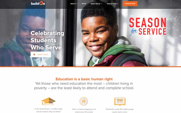
buildOn first catches people’s attention by promoting the campaign and story prominently at the top of their website. The CTA (call-to-action) button, “Lakei’s Story,” leads to a blog post that dives deep into one student’s experience with the nonprofit’s service learning program.
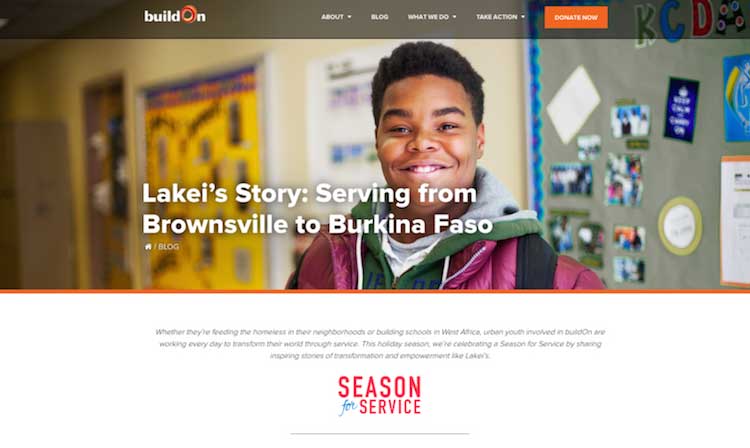
In a perfect blend of text and photos, the organization fully immerses the reader in Lakei’s story. Focusing on one of the organization’s beneficiaries gives readers a very tangible reason the cause is so important. This type of storytelling can help motivate readers to take action, like donate, at the end of the post. Make sure you always include some sort of call-to-action at the end of your blog posts, so that site visitors know what to do next!
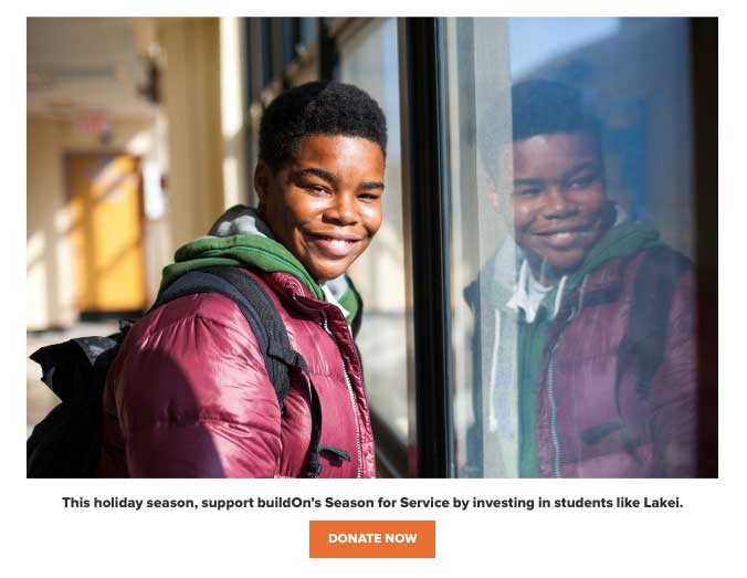
The Takeaway: Leverage your blog to tell stories – The cool thing about this campaign is that it simply leverages a great tool the organization already has – its blog! Updating your blog regularly – and using it as a storytelling medium during specific campaigns – can deepen engagement with supporters, and demonstrate the tangible benefits of donating to your cause. And, if you frequently update it with interesting content, supporters will be drawn back to visit your website more often.
Conclusion
There you have it – the hottest year-end fundraising campaigns on the block. From how to structure your website, to how you can leverage your blog, we hope you’ve taken something from each of these campaigns to try out in your own, no matter what time of year!
Have you found (or do you run) another cool year-end fundraising campaign we should know about? Let us know in the comments!
Read Next: 11 Smart Ways to Promote Your Holiday Fundraising CampaignImage Credit: Flickr User: Sabeth718

10 #GivingTuesday Email Templates


